2012 January

Use Case Study House #1 – A house designed like a web application

Posted by | essay | 19 Comments

usecase-study_house_full

User Experience House Design

Between 1945 and 1966 Arts and Architecture magazine commissioned a series of case study houses which have become icons of modernism.

Since I’m both an architect and a web product designer, I thought it would be fun to design a building the way that web applications are. Use Case Study House is a pun on the Case Study program and a reference to use case design which is fundamentally different from the way buildings are planned.

Web Design vs Building & Product Design

Web design has come along way in the last few years, since the rise of User Experience (UX) specialists, who are closer to architects in what they do than traditional web designers were. That is not to say that some web designers weren’t good UX people, it’s just that the perception of the role of web designer meant that they were marginalized into graphic design.

Again, this is not to say that graphic design is marginal, just that the web is not a graphic design medium but a product design one. This is why many corporations ended up with good looking, Flash-based websites that were largely useless in terms of doing the things a website is supposed to do. At the other end of the spectrum were the pure usability people like Jakob Nielsen who knew how the web worked but produced things that looked awful. A user’s experience is not just determined by functionality but by all sorts of things such as history, culture and perception, or nobody would use a qwerty keyboard or drive a speed limit breaking Porsche.

Because the web is relatively new, web design still has a way to go before it mirrors what architects and product designers do. For example, VP product is not a standard role in startups and where it is its usually less senior than the CTO, or VP of marketing. Much enterprise software and earlier dotcoms were not design driven cultures, so marketing or product marketing people would gather features and have the final say on what was passed to engineering. In architecture this system is only used for low design quality design & build projects.

For web design to move beyond User Experience to be more like Architect driven design, UX people need to be both more technical and more aesthetics driven. [ Update, February 1st 2011: What I should have added here is that UX should also be less about, brainstorming, interviews, focus groups or research – in architecture this constitutes preparation of the brief is often done by the client, and has little to do with the actual process of designing things. ] The role needs to expand from UX so that a ‘product’ person will actually design the architecture of the system (schemas, hardware and scaling strategy, and specify exactly what the product does), but from a designer rather than engineering perspective. I’ve been banging on a about this for years, but few people seem to relate to the problem, so this is not conventional wisdom and possibly wrong.

Somebody said (can’t remember who) that if the great 19th Century engineer, Brunel, was alive today he would have been a software designer. Software design is more interesting because there are things that haven’t been done being innovated all the time, its like being an creative engineer in the Victorian era, and so if people aren’t ready to design software the way architects design buildings, what about trying to design a building based upon web design methods – nothing complicated just a single diagram.

The diagram

The picture above is the end result. The title is a play on the Case Study Houses of the 1940s. Its not a UX design but a UX inspired one. Neither is it an engineering one – its doesn’t use UML or all of the very structured diagram methods 1. because they don’t map to this process and 2. because I don’t like them for these kinds of tasks. Things like UML work for very well defined rational scenarios but user focused design like a house or consumer software is rarely rational, its based on intuitive feel, so you can invent your diagrammatic language as you go along, mix metaphors and use things inconsistently, in order to get the message across to another irrational human being.

How its different

Web design is very linear, its all about flow and eliminating the niche, to get the bulk of people through a primary use case. Many architects tend to think of buildings as objects, the greatest ones, such as Frank Lloyd Wright, often thought about them as interconnected spaces but they focused on the spaces rather than the flow through them – this is analogous to looking at the stage set rather than the choreography. I’ve often wondered what it would be like to design a building like you would choreograph a dance – so that the end design was a picture of a person moving rather than the environment and where if that was sophisticated enough the environment would be defined by the person’s movement.

User Experience based design is more like choreography.

apparition_03

A specific example

I stayed in a hotel recently where the bedroom was connected to the bathroom by a small dressing room corridor. This arrangement really worked – clothes were neither in a ball on the floor on the bedroom or bathroom and the whole flow of getting up and going to bed worked like a perfectly executed dance or a good website, with everything where you wanted it and in the right order. So much so that I measured it (always carry a tape measure).

Why is this at all interesting?

Good design is often about things which seem mundane and obvious after the fact. An example of this on the web would be the ‘permalink’ – few people can remember that before humble online diaries informed people like the New York Times how to publish on the web, you often couldn’t share a link to a news story (it would be at a url like ‘topstory’ which changed when the top story changed). In the architecture world, most people don’t have dressing rooms or walk in closets, but this is less a function of cost and space than of design, most houses have corridors and cupboards. so in the flow based design above the bedroom module uses the same flow as was in the hotel. Added to this flow is a connection to laundry. In the UK in small houses many people put a washing machine in the kitchen, in the US laundry is more often in a basement and in Hungary the washing machine is usually in the bathroom. The last arrangement makes most sense, but it would be better to combine the US and Hungarian model with a flow which has laundry going from a space between washing and sleeping to a laundry area – e.g. with a laundry chute.

The design

The overall concept of the design is to separate the spaces into active and passive, and look at the day to day activity flow to determine how to subdivide and arrange them. Most rooms in houses are based on obsolete uses, hence the ubiquity of loft spaces – which were obviously based on re-using industrial spaces that were not originally designed to be lived in at all. The drawing room has merged with the living room which in turn has morphed into a TV room as the kitchen and dining room have also merged, giving more living space. This is what starts to move towards spaces which are defined less by activity than by type of activity and the type of environment. This, for example, is how traditional Arab courtyard houses worked based on prototypes in Baghdad – rooms were multipurpose and labeled according to the type of climate in them. A house subdivided primarily into active and passive spaces could have a very different feel for each: cozy, soft, dark for the passive, larger, bright, hard surfaces for the active one and this would in turn create different flows.

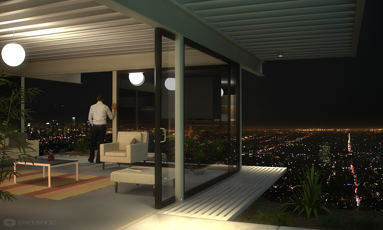
For a view of what this would look like in reality, I applied a watered down version of the active/passive subdivision of space to the barn we converted into our home, below are two pictures of it, to illustrate the point.

The passive space is, cube shaped wooden and windowless, while the active one is rectangular with hard surface and bright overhead rooflights and proportions scaled down from a banqueting hall which make it appear much larger than it really is.

Active space:

active

Passive space:

passive

A new room type, the ‘Maker’ Space.

Going beyond this rough active/passive concept for the flow diagram for Use Case study house #1, I though it would be interesting to add the activities that often happen in the garage which has gone beyond the role of storing cars to being a place of creative activity throughout the US, everything from bands to Apple computer started life in the garage. I brought this space into the house and along side the main active space (the dining area) so that there was an activity space that was all to do with play and making things. A maker space.

Active zone:

usecase-study_house_activezone

The original bedroom flow has been created as a module which can be repeated multiple times and linked to the service spaces (which are all humid – kitchen, bathroom).

Sleeping module:

usecase-study_house_zone4

This might all seem pretentious – the end result is just a simple diagram and its by no means a complete design. But its a diagram that has a lot of work put into it to make it the right diagram, and that’s what makes a good design for a web application.

Internet Pawn

Posted by | essay | No Comments

pawn31

For me, there is no startup that gloms onto the depressing zeitgeist more wretchedly than Borro which follows mockney Wonga into the foggy world of dodgy debt – the very thing that got us into this mess in the first place.

According to their testimonials, “borro’s service sits somewhere between corporate investment and pawn broker”. Exactly one Planck Length away from the latter, because in my experience, corporate investment doesn’t tend to involve leaving your wristwatch as a deposit. With its lending service, Borro wraps the world of technology, banking and the Great Recession into a nasty little ball, with a story so perfectly intertwined that it reads like contemporary Dickens.

borroboo

Borro.com, Boo.com with two ‘r’s.

Pawnbroking is when money is loaned against something real but which can be sold quicker than a house if massive interest is not paid. Its in the 7th circle of debt hell, three rings below sub prime, where desperate people sell their granny’s ring to buy crack. It’s not a nice business, but in times like this, its a thriving one.

Things that you can sell quickly have to be reasonably desirable, so pawnbrokers’ windows are full of the best things that poor people have ever owned, giving a bizarre impression of status amongst the deprived. In a pawnbroker you can find gold jewelry and expensive watches and brands that indicate respectability. If you were to extrapolate this further, a ridiculously distorted caricature of a pawnbroker in a dystopian Gatsby would store fine wines, famous paintings and fancy cars. But in this cartoon, behind the mask of respectability would be something vile and predatory.

pawn

Montague Tigg outside the London pawnshop.

This Gatsbyesque image of diamonds & Porsche’s is exactly what Borro claim to have attached to pawnbroking and without the vileness behind. Sections on their site include diamonds, gold, fine-art and antiques, vintage cars and, unbelievably, luxury yachts. Items are stored in time-locked steel cages with ‘tremblers’ and 24/7 CCTV, except the yachts of course! In addition there is a section on their site about their values which outline ways they differ from the normal practice of pawnbroking.

There are a number of possible reasons for selling pawnbroking as upmarket, whether they work or not. You could try to make pawnbroking completely up-market with a more lucrative clientele or you could make it less downmarket using a few rich users as anchor clients to attract the masses or you could create the illusion that rich people are using the service to reduce the stigma which a user base of ordinary pawnbroker clients would feel.

So is it real?

According to the Wall Street Journal, which has a piece based on an article in the London Times, it is: “Pawnbrokers to the Rich Boom in Britain” Now if this piece had predated Borro’s current PR push I might have been less skeptical that Borro is meeting a genuine demand for rich people to suddenly use pawnbrokers. But it doesn’t, and there are no other facts in the piece to backup any trend. Note the headline isn’t: “Pawnbroker to the Rich Booms in Britain” it’s plural, as if Borro is the winner in a vast new space. It isn’t just claiming that Borro is booming, but that the rich are also busting.

wsj_headline

Its in the journal so it must be true.

But the rich are not going bust in droves. In fact one of the defining trends of the Great Recession is that the gap between rich and poor has widened. If, as the WSJ article says, “borro is sending tow trucks to posh enclaves like Kensington, Chelsea and Fulham to pick up an ever growing list of Porsches and BMW’s”, why have property prices bucked the national UK trend and steadfastly continued to increase there? Sure, the business of pawnbrokers may be thriving, expanding their client base to nip at the heels of the middle classes, but I doubt the last resort lender of the bottom percentage has become a favored recourse for the 1%. In fact the 1% are more likely to be found funding sites like Borro, these days, with nowhere else to put their money.

Here’s what I suspect happened – just my opinion. Borro hasn’t been around long enough to be sending tow trucks to pick up an ever growing list of Porsche’s even if it had struck gold by inverting a thousand year old model of lending. But they’d like to be and that is the story their PR agency is selling. Via the distortions of distance, cultural difference and the persuasiveness of PR flacks, a Wall Street Journalist was duped by a story that if it were true would be emblematic of the bigger picture, of a shit storm of debt default which can only be understood via anecdotes like this. It was a story the writer wanted to believe, it slipped through, no big deal.

But if a single missing ‘s’ in the WSJ makes this story fascinating for an OCD pedant like myself, a single letter typo on their website would be enough to excite Benedict Cumberbatch’s Sherlock.

Borro have a list of things that people have already pawned, from Chateau Lafite claret to a Banksy print and a $40000 painting by Jean Dubuffet. Borro point out that the items “are not accurate representations due to client confidentiality however the loan amounts and artists are precise”.

Now aside from the fact that the confidentiality is convenient for a new business with little loot to show, or that DuBuffet paintings are about $750 per square inch meaning it was on the small size (less than 8 inches square), just like Arthur Daley’s memorably dodgy Levys [sic], DuBuffet isn’t spelled the way Borro did: DeBuffet.

borro_spelling_mistake

DeBuffet is spelled DuBuffet

dubuffet_prices

No big deal I guess, many sites have typos. Perhaps their picture expert did dictate the details and passed on no emails with what they had sold. But in the world of Occam’s Razor, I’m not buying it. Forgive me if the thought hasn’t crossed my mind that there are no DuBuffets in Borro’s trembler cage vaults, no lines of trucks waiting to haul Porsches out of Chelsea parking spaces and that neither the business of pawnbroking has become upmarket nor have the 1% become the latest victims of austerity.

Even if Borro is just a dressed up pawnbroker why is it intrinsically worse than a bank or other distressed debt sites like Wonga?

Banks and even Wonga don’t want you to go bust, or they don’t make money. Some people won’t pay, and the debts will have to be written off, but most will pay back and the net profit will be the interest minus the rate of default. But if everyone defaults on a pawnbroker they can still make money.

On the face of it, Borro aren’t trying to profit from a default. From their values section: “[We] Realize the highest value for our customers’ assets in the ‘last resort’ event of default, so that their loans are repaid in full and any excess is returned to them”. But think about that. If the loan is at a very high interest rate (I’ve seen figures like 60% bandied around) then the selling of collateral is already yielding a big profit before any money is handed back to the borrower. More importantly, with the hand back, there is no incentive for Borro to sell for a maximum beyond the loan value, and businesses where goodwill is in conflict with incentives are either not good will or not good business.

As I’ve written before, the last Internet boom failed when people though they could wave a magic wand at any offline business and Internetify it, bringing unimagined riches as keyboards clattered like a million cash registers. Borro looks to me to be making the same mistake, trying to take pawnbroking online and make it something that it isn’t from a business perspective and which fails to understand how the web works from a product one.

Why does all this matter?

This matters to me on every level. As an Internet entrepreneur, Borro is the kind of mad business that helped creat the last crash. As a technologist, if that happens again it will destroy faith in one of the things that can help get us out of the current mess via innovation or the desire to make things simpler and better such as Simple (BankSimple). And as a person, Simple in turn reflects the ability of technology to solve rather than perpetuate the money-for-its-own-sake mistake of the debt-fueled, financial arms race that nearly destroyed the global economy.

More than that, by having, what is suspect was harmless PR driven fiction enter the archives of the Wall Street Journal, with the title “Pawnbrokers to the Rich Boom in Britain” and the date “January 4, 2012” this innocuous article could be re-quoted to rewrite history and create the cruel illusion that the 1% were in this together with the 99%.

situs toto situs toto cerutu4d cerutu4d cerutu4d cerutu4d bo toto pulsa bo togel bo togel bo togel bo togel cerutu4d bandar toto macau bo toto situs togel situs togel cerutu4d cerutu4d cerutu4d situs togel bo toto