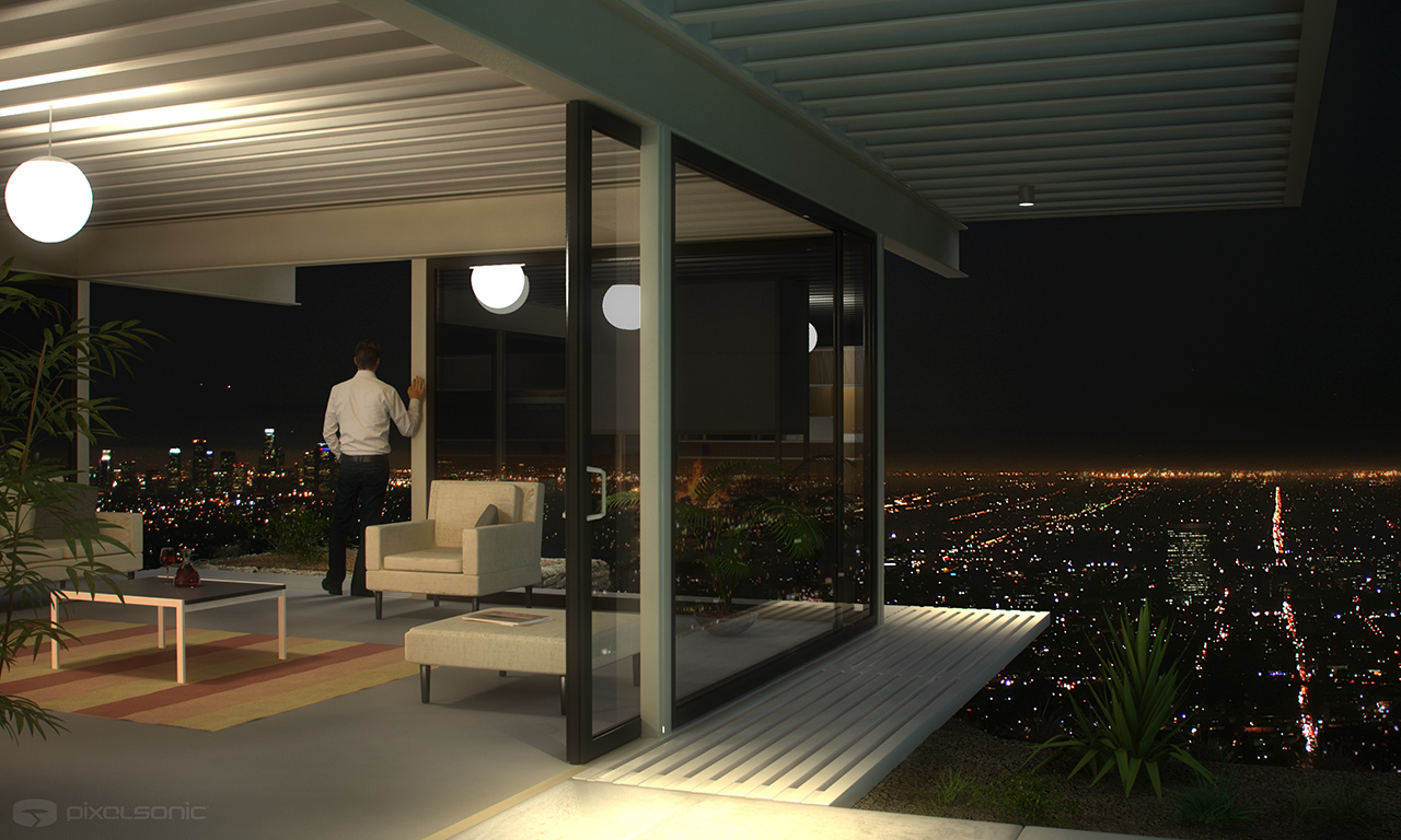
User Experience House Design
Between 1945 and 1966 Arts and Architecture magazine commissioned a series of case study houses which have become icons of modernism.
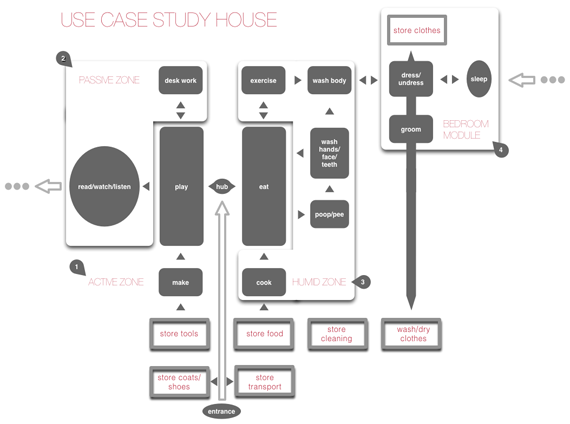
Since I’m both an architect and a web product designer, I thought it would be fun to design a building the way that web applications are. Use Case Study House is a pun on the Case Study program and a reference to use case design which is fundamentally different from the way buildings are planned.
Web Design vs Building & Product Design
Web design has come along way in the last few years, since the rise of User Experience (UX) specialists, who are closer to architects in what they do than traditional web designers were. That is not to say that some web designers weren’t good UX people, it’s just that the perception of the role of web designer meant that they were marginalized into graphic design.
Again, this is not to say that graphic design is marginal, just that the web is not a graphic design medium but a product design one. This is why many corporations ended up with good looking, Flash-based websites that were largely useless in terms of doing the things a website is supposed to do. At the other end of the spectrum were the pure usability people like Jakob Nielsen who knew how the web worked but produced things that looked awful. A user’s experience is not just determined by functionality but by all sorts of things such as history, culture and perception, or nobody would use a qwerty keyboard or drive a speed limit breaking Porsche.
Because the web is relatively new, web design still has a way to go before it mirrors what architects and product designers do. For example, VP product is not a standard role in startups and where it is its usually less senior than the CTO, or VP of marketing. Much enterprise software and earlier dotcoms were not design driven cultures, so marketing or product marketing people would gather features and have the final say on what was passed to engineering. In architecture this system is only used for low design quality design & build projects.
For web design to move beyond User Experience to be more like Architect driven design, UX people need to be both more technical and more aesthetics driven. [ Update, February 1st 2011: What I should have added here is that UX should also be less about, brainstorming, interviews, focus groups or research – in architecture this constitutes preparation of the brief is often done by the client, and has little to do with the actual process of designing things. ] The role needs to expand from UX so that a ‘product’ person will actually design the architecture of the system (schemas, hardware and scaling strategy, and specify exactly what the product does), but from a designer rather than engineering perspective. I’ve been banging on a about this for years, but few people seem to relate to the problem, so this is not conventional wisdom and possibly wrong.
Somebody said (can’t remember who) that if the great 19th Century engineer, Brunel, was alive today he would have been a software designer. Software design is more interesting because there are things that haven’t been done being innovated all the time, its like being an creative engineer in the Victorian era, and so if people aren’t ready to design software the way architects design buildings, what about trying to design a building based upon web design methods – nothing complicated just a single diagram.
The diagram
The picture above is the end result. The title is a play on the Case Study Houses of the 1940s. Its not a UX design but a UX inspired one. Neither is it an engineering one – its doesn’t use UML or all of the very structured diagram methods 1. because they don’t map to this process and 2. because I don’t like them for these kinds of tasks. Things like UML work for very well defined rational scenarios but user focused design like a house or consumer software is rarely rational, its based on intuitive feel, so you can invent your diagrammatic language as you go along, mix metaphors and use things inconsistently, in order to get the message across to another irrational human being.
How its different
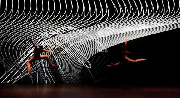
Web design is very linear, its all about flow and eliminating the niche, to get the bulk of people through a primary use case. Many architects tend to think of buildings as objects, the greatest ones, such as Frank Lloyd Wright, often thought about them as interconnected spaces but they focused on the spaces rather than the flow through them – this is analogous to looking at the stage set rather than the choreography. I’ve often wondered what it would be like to design a building like you would choreograph a dance – so that the end design was a picture of a person moving rather than the environment and where if that was sophisticated enough the environment would be defined by the person’s movement.
User Experience based design is more like choreography.
A specific example
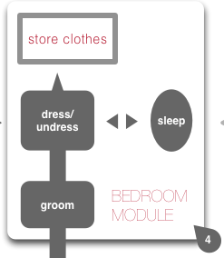
I stayed in a hotel recently where the bedroom was connected to the bathroom by a small dressing room corridor. This arrangement really worked – clothes were neither in a ball on the floor on the bedroom or bathroom and the whole flow of getting up and going to bed worked like a perfectly executed dance or a good website, with everything where you wanted it and in the right order. So much so that I measured it (always carry a tape measure).
Why is this at all interesting?
Good design is often about things which seem mundane and obvious after the fact. An example of this on the web would be the ‘permalink’ – few people can remember that before humble online diaries informed people like the New York Times how to publish on the web, you often couldn’t share a link to a news story (it would be at a url like ‘topstory’ which changed when the top story changed). In the architecture world, most people don’t have dressing rooms or walk in closets, but this is less a function of cost and space than of design, most houses have corridors and cupboards. so in the flow based design above the bedroom module uses the same flow as was in the hotel. Added to this flow is a connection to laundry. In the UK in small houses many people put a washing machine in the kitchen, in the US laundry is more often in a basement and in Hungary the washing machine is usually in the bathroom. The last arrangement makes most sense, but it would be better to combine the US and Hungarian model with a flow which has laundry going from a space between washing and sleeping to a laundry area – e.g. with a laundry chute.
The design
The overall concept of the design is to separate the spaces into active and passive, and look at the day to day activity flow to determine how to subdivide and arrange them. Most rooms in houses are based on obsolete uses, hence the ubiquity of loft spaces – which were obviously based on re-using industrial spaces that were not originally designed to be lived in at all. The drawing room has merged with the living room which in turn has morphed into a TV room as the kitchen and dining room have also merged, giving more living space. This is what starts to move towards spaces which are defined less by activity than by type of activity and the type of environment. This, for example, is how traditional Arab courtyard houses worked based on prototypes in Baghdad – rooms were multipurpose and labeled according to the type of climate in them. A house subdivided primarily into active and passive spaces could have a very different feel for each: cozy, soft, dark for the passive, larger, bright, hard surfaces for the active one and this would in turn create different flows.
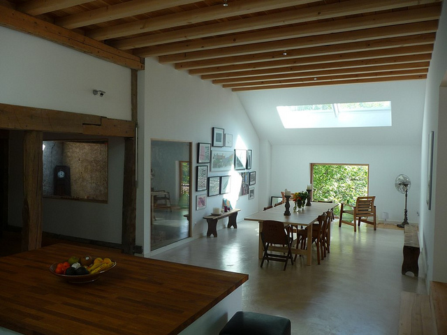
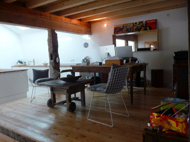
For a view of what this would look like in reality, I applied a watered down version of the active/passive subdivision of space to the barn we converted into our home, below are two pictures of it, to illustrate the point.
The passive space is, cube shaped wooden and windowless, while the active one is rectangular with hard surface and bright overhead rooflights and proportions scaled down from a banqueting hall which make it appear much larger than it really is.
Active space:
Passive space:
A new room type, the ‘Maker’ Space.
Going beyond this rough active/passive concept for the flow diagram for Use Case study house #1, I though it would be interesting to add the activities that often happen in the garage which has gone beyond the role of storing cars to being a place of creative activity throughout the US, everything from bands to Apple computer started life in the garage. I brought this space into the house and along side the main active space (the dining area) so that there was an activity space that was all to do with play and making things. A maker space.
Active zone:
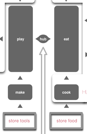
The original bedroom flow has been created as a module which can be repeated multiple times and linked to the service spaces (which are all humid – kitchen, bathroom).
Sleeping module:
This might all seem pretentious – the end result is just a simple diagram and its by no means a complete design. But its a diagram that has a lot of work put into it to make it the right diagram, and that’s what makes a good design for a web application.
[…] by David Galbraith. Click to […]
Great idea Dave, looking at flow and use would seem to be fundamental to all architecture yet it isn’t. It doesn’t require a web app metaphor, it makes sense with or without that analogy. I’d love to redesign my humble apartment along these lines.
Hi Tom. Well maybe I can help you do that. I’d like to do a flow that gets really granular. For example, taking dishes out of a rack in a dishwasher to put in a pile elsewhere seems dumb – it would be better to have racks which rolled out of the dishwasher altogether – these exist in bars (or two dishwashers for that matter).
[…] this essay: Use Case Study House #1 – A house designed like a web application he offers a home floor plan (above) that looks very much like a flowchart for designing a web […]
[…] this essay: Use Case Study House #1 – A house designed like a web application he offers a home floor plan (above) that looks very much like a flowchart for designing a web […]
[…] this essay: Use Case Study House #1 – A house designed like a web application he offers a home floor plan (above) that looks very much like a flowchart for designing a web […]
[…] this essay: Use Case Study House #1 – A house designed like a web application he offers a home floor plan (above) that looks very much like a flowchart for designing a web […]
The cross-pollinating of architecture and computation goes back at least sixty years, longer if you include the GSD development of bubble diagrams in the 1940’s. Later on you have Christopher Alexander and the idea of patterns, which were originally an architectural concept. This is a great attempt to keep that history going. Tom, while it’s true that much of the architecture published in the mass media is heavy on imagery, it’s disingenuous to suggest that most architecture is the result of a primarily visual process. Practicing architects, even many famous ones, are very aware of the complicated relationships between what they call “program” and the forms that result. That being said, anyone willing to help develop new methods to help make the user experience of architecture more rich and engaging is doing a great service to our built environment — keep thinking and posting about this!
@Ben. Yes, I agree, the bubble diagrams are something which more web designers should be aware of, in the same way that A Pattern Language is read more by programmers than by architects, for its relationship to Object Oriented Design, these days.
On that subject, the Alexander method is different and equally interesting – the patterns are like ingredients in a recipe and a recipe again is very different from a blueprint (you don’t specify a fruit cake design with co-ordinates for each raisin).
The syntax of Alexander’s pattern language is quite strict (everything must have a diagram and picture, if I remember correctly) and the relationship between patterns is hierarchical. I can imagine a photo sharing site for designers where tagged annotations create groups of patterns on the fly, and that any pattern can link to any other (i.e. its more like a web than a tree). I’ve always wanted to build this.
[…] his essay: Use Case Study House #1 — A house designed like a web application he offers a home floor plan that looks very much like a flowchart for designing a web […]
This really reminds me of the film Salmer fra kjøkkenet (Kitchen Stories) which tells the story of the rational social scientific Swede’s attempt to rationalise the romantic Norwegians (there’s a lot to this story historically too). Quite wonderful if you haven’t seen it.
http://www.imdb.com/title/tt0323872/
Hello David,
I like very much this idea and blog post. My mind immediately starts jumping to imagining what these spaces would be like and what a possible floor plan might be. I am wondering if you could take the next step and translate your diagram into a requirements document or even a step further and sketch out a simple / rough floor plan? I for one would find following along with this process fascinating, as I am sure many of your readers would.
[…] It’s a thought provoking idea and I like how he found the interconnectedness in his two fields of study and developed a solution that addresses needs across spaces that most people would consider vastly different, physical vs. virtual interaction. He explains his ideas and thoughts on the two different fields in much more detail on his website. […]
Hi David,
Very cool. I like this idea. I agree the flow is the foundation of user experience. Visual makes the users love using the website, but easy flows and neat functionality would be the reason why they stay.
I am amazed that you act both as an architect and interaction designer. I remember an old story told by one of my professors. He said quite a while ago, some scientists got stuck on some issues (can’t recall what issue it was), but one of them happened to tell this to a friend in Electronic Engineering, and this friend said “why! that’s super easy” and solved the issue for them.
So from then I started thinking that the issues in this world are really intertwined with each other – maybe we can in fact solve any issue, if we find the right person in the right area
I guess we can use this idea here too:P
Yingying
[…] activities simple to perform because the functional spaces flow perfectly. Architect and webpreneur David Galbraith likens the ideal home design to the ideal web application design. In both architecture and web […]
[…] activities simple to perform because the functional spaces flow perfectly. Architect and webpreneur David Galbraith likens the ideal home design to the ideal web application design. In both architecture and web […]
[…] activities simple to perform because the functional spaces flow perfectly. Architect and webpreneur David Galbraith likens the ideal home design to the ideal web application design. In both architecture and web […]
This is an awesome concept, if houses are designed like web applications people don’t need to ask where things are it will be so fluid to live in such a house that it can easily blend with your mood, houses can even b further customised to the kind of person one is, just like what one does on their computer so the more likeable pages the more prestigious those rooms or areas will b like
[…] the perception of the role of web designer meant that they were marginalized into graphic design…full article Architecturecase studydesignhouseinteriorUX SHARE : […]