How architecture keeps you comfortable and can be understood from the design of decent modern shoes.

Posted by | Uncategorized | 2 Comments

Doing some architecture again (renovating this) after fifteen years is making me look at it with a fresh eye.

For example, there is a big problem with green building terminology, it often says the opposite of what it means and many architects seem to have misunderstood the design issues because the terminology is misleading. As an example of the lunacy in terminology, in the context of building materials (and clothing), breathable usually means airtight. This often makes things hard to understand, but the design concepts are actually straightforward and I’ll try and decipher some of them here.

Most of the innovation of the last 15 years is mirrored in the modern technology used in sports clothing and most of what there is to be understood about architectural innovation, such as breathing and composite materials can be understood from the design of decent modern shoes.

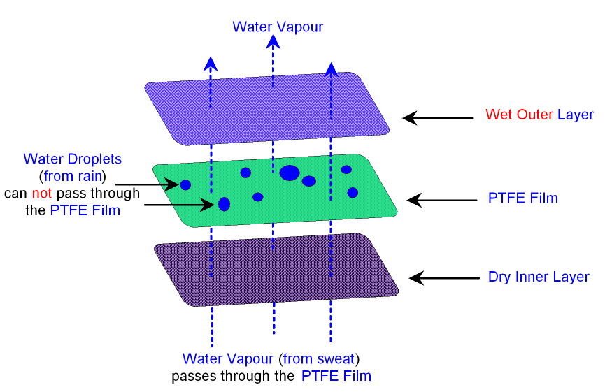
Once you’ve got a building to stand up, you want to: (a) avoid water getting in by flowing, but (b) let water vapor (sweat and steam) get out by soaking and then evaporating and (c) not let too much heat to get in or out via conductance or draft.

Because building usage and climate are dynamic but building envelopes are not, there are no ideal solutions. The best you can hope for is to dampen the extreme cases and create what Reyner Banham called a ‘well tempered environment’, after all, perceiving the different seasons is pleasant, unless you live at the North Pole.

For the water vapor, air and water, buildings often have vapor barriers and air barriers. They can be the same thing. Vapor barriers are often required by code but scientifically optional and air barriers are often optional but scientifically necessary.

A vapor barrier stops diffusion of water gas through a difference in humidity. An air barrier stops flow of air through an air pressure difference caused by temperature difference (resulting in wind or convection).

Now for the hopeless terminology that leads to all the confusion.

Water vapor is a gas, but a vapor barrier is essentially to do with dealing with water (which we tend to think of as a liquid) and the effects of soaking rather than leaking. Vapor barriers are not about leaks but about surface transfer through diffusion or soaking, so vapor barriers can be made from the opposite types of material: a waterproof material such as a plastic bag (water condenses on its surface and evaporates) or, in theory (but in practice only in the case of clothing such as linen), a water absorbent material that soaks the water vapor up for a bit then lets it evaporate later. In the building case this is when people leave out a vapor barrier and use insulation which can soak up a bit of water temporarily, without damage. This ironic situation is a bit like the difference in a bulletproof jacket that works by opposite means, either bouncing bullets off (hard material like steel plate) or absorbing the impact (soft material like a sandbag).

The air barrier is not so much about heat loss as about water vapor getting trapped and condensing – i.e. the primary purpose of an air barrier is to be a water barrier. But the water gets there this time via drafts and not diffusion.

Secondly, an air barrier can be breathable. Breathable means letting water vapor out, by diffusion, while still being windproof. As above, this means you can use the opposite approach – thick water absorbent and wind proof or thin wind proof with little holes for diffusion (think Goretex).

And the confusion doesn’t just extend to the terminology, it extends to the practice:
Vapor barriers are often required by code but science suggests they should be optional. Their position is not optional yet it is – i.e. it should always go on the humid side of insulation, but this can be on the inside or the outside depending on the climate and the occupancy of a building, both of which change. Buildings in Florida are often the reverse, in terms of moisture control, from New York. Vapor barriers, although they are dealing with a gas, do not have to be air tight, they just need to cover enough surface area.

Air barriers on the other hand are optional in codes (shortly to be mandatory) but a proven idea scientifically. You can put an air barrier anywhere in the envelope, but it should form a continuous sheet – i.e. be airtight. An air barrier can be a vapor barrier as well (in which case you should put it in the right place, warm side, or more accurately ‘more humid side’ of the building envelope).

If an air barrier is non-breathable, don’t stick it to the cold side (outside) of insulation without a gap, or water will condense and not be able to evaporate. In general, where water condenses there should be some air flow on the side of the material it condenses on.

Air barriers mean air tight, and they are the principal behind the idea of things such as Passive Homes which seal things up like a thermos flask then have to add drafts back to get rid of sweat and steam via fans.

Ironically, because the science behind Passive Houses is psychologically clinical and unnatural it seems opposite to the idea of traditional building styles which controlled the environment automatically by imperfect fit and natural materials. Yet the people who champion the latter are the natural allies of what Passive Homes are trying to do – be ecologically sound. There is a commonly held miss-belief that Passive Houses, because they are air tight aren’t breathable. Traditional materials are breathable, but so are air tight buildings, since the breathability refers to moisture release through diffusion rather than movement of air.

To remove the confusion:

1. Think of a vapor barrier as a ‘water condenser and evaporator’ system (it need not be a barrier at all and its a mechanism rather than a thing). You need a system, but you don’t necessarily need the thing.

2. An air barrier is a genuine barrier, it’s a ‘draft excluder’, but the fundamental problem is not the air but the water it carries getting left behind. An air tight system can still be breathable and be a combination air and vapor barrier, but the word breathable would be much better if it were replaced with something like ’self drying’.

In other words a building design should stop water getting trapped in bits of the building envelope and get rid of any that does through evaporation, using air and vapor barriers.

You need a self-drying draft excluder. That’s all there is to it.

Tim Berners-Lee: Confirming The Exact Location of the Invention of the Web

Posted by | Uncategorized | 81 Comments

theroom

[ Update, Feb 2014. Plaque placed outside room where web was invented.]

Success (of sorts)!

ARS Electronica have given an award to Tim Berners-Lee and CERN for the invention of the web. They had heard via a friend at CERN that I had shown the room where the web was developed and explained the story, that the existing commemorative plaque was outside where the web was developed, not where it was invented and where the first web server was located.

They insisted that their plaque go outside the latter location, which means that there is now a plaque outside the room where the web was invented, making it much more likely that it will survive any accidental renovation.


[ Update, April 2013. Save the Room ]

CERN have just announced that they are re-hosting the first web page. It would be great to take this further and host the original web server in the room where it was first located.

I have been trying to pitch this to people at CERN but haven’t managed to persuade anyone yet, and since the room is used as general office space at CERN its is in danger of being refurbished or changed.

Why would you want to do this?
To celebrate the invention of the Web is to celebrate knowledge, its not a piece of religious of political heritage but something that everyone can be a part of. Unlike many other inventions it has a known location and that location is currently unchanged, but there is nothing to protect it.

I suspect that in 100 years, CERN’s legacy as the birthplace of the web will surpass the discovery of the Higgs, W or Z bosons. The web will have had an impact on every day life which could be compared to that of printing, in which case this location could be compared to Guttenberg’s workshop, which had to be reconstructed many years after, when people realized its importance, too late.

Now you could argue that the web is not as important as the invention of printing (I disagree) but its certainly up there with say a major artist’s studio. In which case, consider the extraordinary length’s taken to preserve the floor in Jackson Pollock’s studio and consider that the room where the web was invented is treated just like any other room.

What could be done?
Space is scarce at CERN, and expense has to be justified, so one way of preserving this room would be to make the occupant have some knowledge of its significance and some relevance to it. When I first visited the room the person using it was a computer guy who did not know what had happened there and was very excited to find out. So that would be enough – that the occupant was a computer scientist and that the room was not to be altered.

Taking this a bit further, perhaps a computer scholarship could be created to fund the occupant of the room to do something that takes the spirit of the web further. Perhaps the original web server could be relocated to the room and it could be explored by mapping it on say Google Streetview, so that everyone could visit it. Further still, there are the rooms where the project for the web was developed, these are also historically important.

If you believe, like I do, that preserving the location of the invention of the web would be a good idea, make yourself heard. Tweet to @CERN with this url and the hashtag #savetheroom.

Save The Room!


[ Update, Jan 2012: One of the more interesting consequences of the details below, that hasn’t been picked up anywhere, is that technically the web was invented in France, not Switzerland.]

bldg31

The blue marker on the map above shows building 31. Note where the border is.

I’ll bet if you asked every French politician where the web was invented not a single one would know this. The Franco-Swiss border runs through the CERN campus and building 31 is literally just a few feet into France. However, there is no explicit border within CERN and the main entrance is in Switzerland, so the situation of which country it was invented in is actually quite a tricky one. The current commemorative plaque, which is outside a row of offices where people other than Tim Berners-Lee worked on the web, is in Switzerland. To add to the confusion, in case Tim thought of the web at home, his home was in France but he temporarily moved to rented accommodation in Switzerland, just around the time the web was developed. So although, strictly speaking, France is the birthplace of the web it would be fair to say that it happened in building 31 at CERN but not in any particular country! How delightfully appropriate for an invention which breaks down physical borders. ]


I wrote to Tim Berners-Lee after exploring CERN looking for the location where the web was invented. His replies regarding the exact locations are below (I’ve put up photos of the excursion as an Oobject list, here ).
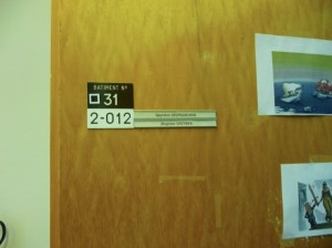
There is a plaque in a corridor in building 2, but no specific offices are indicated and there is some ambiguity as to what happened where, in building 31. Thomas Madsen-Mygdal has a gallery showing locations in building 31 and 513, but there are very few places on the web documenting these places. I took photos of the plaque, such as the one here, with Creative Commons licenses, so that they could be used elsewhere.

The reason I’m interested in this is that recognizing the exact places involved in the birth of the web is a celebration of knowledge itself rather than belief, opinion or allegiance, both politically and spiritually neutral and something that everyone can potentially enjoy and feel a part of.

Secondly, many places of lesser importance are very carefully preserved. The place where the web was invented is arguably the most important place in 2 millennia of Swiss history and of global historical importance.

Lastly, this kind of information is perhaps overlooked as being so obvious as to be common knowledge, exactly the sort of thing that sometimes gets forgotten. I’m not suggesting that the locations have indeed been overlooked, but they are not preserved or all indicated and the people I spoke to didn’t know the full details. So just in case…

DG: Where were you (at CERN and which building/rooms or home) when you thought of or were writing the original proposal for the web in 1989?

TBL: I wrote the proposal, and developed the code in Building 31.
I was on the second (in the European sense) floor, if you come out of the elevator (a very slow freight elevator at the time anyway) and turn immediately right you would then walk into one of the two offices I inhabited. The two offices (which of course may have been rearranged since then) were different sizes: the one to the left (a gentle R turn out of the elevator) benefited from extra length as it was by neither staircase nor elevator.
The one to the right (or a sharp R turn out of the elevator) was shorter and the one I started in. I shared it for a long time with Claude Bizeau.
I think I wrote the memo there. [ dg: proposal for the web was written, i.e. web was ‘invented’ in room 2-010 ] When I actually started work coding up the WWW code in September 1990, I moved into the larger office. That is where I had the NeXT machine, as I remember it. [ dg: larger office, i.e. where first web server was and software was written, where web was ‘created’, is room 2-012 ] The second floor had pale grey linoleum, the first floor, where Peggie Rimmer had her office, had red lino; the third floor had pale yellow lino. The ground floor had I think green lino. Also on the second floor was the Documentation et Données, later Computing and Networking, HQ with David Williams at one point heading it up.

DG: For the development of the web, can you remember which offices were used in building 31 or off the corridor shown in building 2 in the attached image?

TBL: Building 2 I never had an office in. Robert Caulliau did, and various students, including Henrik Frysyk Nielsen and Hakon Lie, and Ari Luotonen, worked there.

DG: Was some of it inspired at home and was that here: Rue de la Mairie, Cessy (France)?

TBL: My house was [exact address removed since people live there] Rue de la Mairie, but I rented it out for some time around 1990 and actually lived in Les Champs Blancs, Chavannes de Bois [Switzerland]. But then we moved back to Cessy for a year before leaving.

[ Update: I went back and took some pictures (Creative Commons license so you can use them) of the room where TBL created the original proposal for the Web. And have some exciting news to share about it soon! ]

room1

Door to the room where the web was created

room2

The Polish coder who currently occupies the room didn’t know its significance. He was very happy to find out.

room3

Ben Segal who helped setup the original web server in the room where the web was created

Connections’ 911 Connection. A Perfect Coincidence to Show There are no Conspiracies

Posted by | myth busting | One Comment

People look for patterns and co-incidences, and in the modern environment there are more co-incidences than our brains are calibrated to think are normal – what Richard Dawkins calls the PETWAC (Population of Events That Would Happen to Appear Co-incidental).

What follows below doesn’t appear to figure on the web as a 911 conspiracy, but it could easily. It sends shivers up my spine, but the fact that it exists among the millions of hours of video available to watch is merely an example of the increased PETWAC compared to when we drifted across the African Savannah hundreds of thousands of years ago in small bands of people with limited experiences available. This is the factor which creates the illusion that drives conspiracies.

1. The First Episode of Connections opens with James Burke Outside of the World Trade Center in New York. (Opening -> 0:48)

2. A disaster is brewing. (5:18 -> 6:50)

3. (8:45 ->) A plane is heading towards the buildings at the opening. Its flight number…

Switzerland and Islam

Posted by | religion | One Comment

switzerland

On the left: Swiss poster demonizing Islam, to support the ban on minarets. On the right: Swiss poster proclaiming an understanding of Arab culture, soliciting funds for a private bank.
The controversy around the Swiss racist anti-minaret poster was understandable – it’s in the style and colors of pre-war Nazi propaganda for heaven’s sake. But Swiss racism is more complicated than it would first appear, particularly when it comes to money.
Anti Muslim sentiment in French speaking Switzerland in particular, is possibly stoked by irrational fears of poorer French immigrant Muslims crossing the border to seek work in prosperous Geneva from its French hinterland. The reality of Geneva is that it is culturally quite Arab, even if the Swiss would deny it. The world’s most expensive watches and private banking make Geneva a playground for oil rich Middle Easterners, a cliche – but true. and to prove it, these type of Muslims are welcomed at the airport, by posters in Arabic proclaiming an ‘in-depth understanding of Arabic culture’, with little sense of irony.

Sheep: Truth vs Fiction

Posted by | Uncategorized | 2 Comments

sheep_truth_vs_fiction

My son likes Shaun the Sheep, a cute character created by Wallace and Gromit’s Nick Park. Yesterday’s trip to a petting zoo revealed the diabolical, moth-eaten, nightmare-generating monster on the right, which threatens to leave him mentally scarred forever.

[Interestingly, he just pointed to the thing on the right and said ‘Shaun the Sheep’. Which is like pointing to Jabba the Hut and saying Leia. ]

Social Networks and Creativity. Why Geneva Might be a Better Model than New York

Posted by | Uncategorized | 2 Comments

How do you bump into new people in a social network?

[ The social graph – how do I meet new people here? ] I have been back in New York for less than 48 hours and have twice bumped into the person that is the contact link to the people I most want to meet when I’m here. This kind of serendipitous interaction almost never happens in Geneva, where I’m now living. I suspect that its occurrence is non-linear (i.e. it requires a certain critical mass of interaction for it to happen) and that this rather than planned meetings are what make cities centers of creativity and innovation. Understanding this process perhaps has important implications for the design of social networks.

[ Chance Meeting (in NY), by Martin Lewis ] In some ways, this is obvious, but the distinction between planned and unplanned interaction has definite consequences. Creativity is often viewed as an active process of invention by intelligent and creative types, however what if it was the other way around – a question of accident and any person of average intelligence being in the right place at the right time?
As an example, I became an architect (something that contrary to popular misconception is largely an art not a science), having originally come from a scientific background. People who are scientists often look for a description in words as to why a work of art is interesting, its why rather uninteresting artists like Escher are nerdy favorites – the idea is more interesting than the picture. I started architecture by producing designs that all had a story but weren’t visually original, but I remember the day at architecture school when I really ‘got it’, when I was able to design something new rather than the kind of superficial gimmick that a rational approach to design always produces. The way that I designed something original was by accident – I created enough mess around me that I made a mistake that actually turned out to be interesting.

[ Escher – the scientist’s artist ] By creating an environment where mistakes were likely to happen and by editing the errors that arose, I was able to be creative. Not only that, but the creation of mess that reduced my ability to be organized but increased my ability to do new things, was a perfect cliche of the creative stereotype. What if the bohemian mess and individualism weren’t a byproduct of creativity, but the thing that enabled creativity in the first place, the thing that allowed accidents to be selected to create something that could not have been imagined?

[ Francis Bacon’s studio – Francis was a painter not an accountant, and his workplace was messy ] This idea of accidental design, is how Murray Gell-Mann describes the process of evolution: as “the accumulation of frozen accidents”. It means artists should perhaps not get too big-headed, that if humans can be created without a designer god that art can be created without a human with extraordinary powers. It means that innovation and design is a by product of selection of accidents and dependent as much on a particular environment as the people who occupy it.

[ Murray Gell-Mann – Evolution happens through the accumulation of frozen accidents ] What is important for creativity is an environment that allows for accidents. But accidents are important for things beyond the creative arts: for meeting people and getting things done, from doing deals to dating – for social networking. Social networking requires chance interactions, but does this mean that social networks need to replicate the bumping into new people that a city with the size and cultural openness of New York offers over Geneva.
The online world is more artificial than the real world, by definition, and therefore social interaction can be stilted and somewhat unsatisfactory, even if it can span the globe instantaneously. From flame wars to the fact that sarcasm rarely goes down well online, the online experience of communication is not quite as interesting as the real world, its a bit like living in Geneva rather than New York.
Perhaps there is something to be learned from Geneva rather than New York when it comes to finding out how to create serendipity in a more artificial social environment? In which case, the thing to look at might be golf. Intermingling in Geneva is largely through sporting activities in the mountains and on the lake, and as elsewhere, on the golf course.

[ Golf – not exactly hip or bohemian ] Despite requiring a massive amount of time and money – taking most of the day off ‘work’ for the same hourly rate that people earn, golf ironically shares something in common with casual bumping into people and the resultant creativity. When you play golf with someone, you spend several hours with them but there is no requirement to communicate, you can either play golf, or you can play golf and chat. It creates a very simple framework for deals to happen by accident, though unplanned unstructured communication without pressure.

[ Geneva – If you can make it happen here you can make it happen anywhere ] Golf allows for people to communicate without a prior agenda and deals to be done serendipitously. And it allows for this to happen in places as far removed from the creative enclaves of lower Manhattan and Brooklyn and its bohemian denizens as a Swiss golf course infested with private bankers. If you can make it happen here, you can make it happen anywhere. In other words, golf creates a creative networking environment without requiring a creative environment or creative people. And like the online world, it all make believe, taking place in a virtual recreation of the Scottish countryside in places like the Nevada desert. Pretty amazing really.

[ Virtual reality – a Las Vegas golf course recreates a quasi Scottish landscape in the Nevada desert ] For social networking to create a replicatable model for serendipitous interaction which overcomes the giant drawback of the fact that people aren’t actually there, perhaps its needs something more akin to golf than a bohemian bar and perhaps it needs to look at how people manage to network in a place that is difficult, like Geneva, rather than one which is easy, like New York.

Imagining The Tablet from a Design Perspective

Posted by | Uncategorized | 5 Comments

Computers used to occupy a whole floor of a building, then a room, a desk and ultimately a lap. The laptop is the default form factor for computing, with the smartphone occupying an emerging niche for on the go. But while the laptop replaces the desktop in most cases, the smartphone doesn’t replace the laptop, but is something to have in addition to it.
The tablet will replace neither the laptop or the smartphone, so matter what the hype, it is destined to be an ancillary form factor for computing devices.
mac-pc
[ The Kindle just isn’t cool. I’m a Tablet. And I’m a Kindle.] That being said, the tablet will fill the niche that the Kindle aspires to. It’s an area that generates lots of press, because its the one occupied by print media itself which is currently delivered via the medium of dead trees. Its an anachronism that highlights an obsolete business model looking for a savior, but the Kindle isn’t it. Amazon’s device placed its bet on an irrational design choice which was based on thinking about dead trees rather than what’s on them, e-paper vs a screen, a product decision which removes more functionality than it adds. The current state of the art E-paper renders the Kindle a black & white, video-less computer that you can’t read in bed without the light on. The Kindle is a bad design because it focuses on the medium (paper) rather than the message ( video, sound, color). Electronic books, magazines and newspapers need not look like their paper equivalent, especially the drab black and white variety, they will have color and videos and will look much more like a web site than a dead tree. Apple know this and they will crush the Kindle.
The tablet will be positioned as the ultimate media reader, it will kill the Kindle near instantly by focusing on what the Kindle tried to, but wrongly – the screen. To differentiate reading the Vogue website on a laptop from reading Vogue on the tablet, Apple will arrange custom sites and deliver a device with a screen resolution and quality never seen before. Apple will deliver something with the interaction of a website and the seductiveness of a glossy magazine. It will offer syndicated, tablet-enhanced content and will be hailed as the savior of an entire industry.
But perhaps the notion of a tablet as an e-reader misses something much more interesting? Newspapers and magazines are not that interesting – despite the business model problems which create a lot of noise, magazines and newspapers already have a savior: common or garden websites. The fact that these website have different economics that traditional media doesn’t like is tough luck. Whatever Apple tries to do, a tablet site will basically be a pretty website, and by following the iTunes Music Store or App. store model, unlike with music or software, Apple will be taking something that is already legally available on the web and corralling it into a controlled, walled-garden environment under the yet-to-be-proved auspices of value-add.
In terms of hardware, the tablet might offer something qualitatively superior but it won’t offer much that a laptop doesn’t already. In fact, without a stand, or a keyboard that can be used with two hands while holding it, it could be regarded as a willful, unergonomic gimmick, something based on the idea that a digital newspaper doesn’t look right with a keyboard. This is the UI of science fiction movies, not the real world, nonetheless, such purity will play into the hands of Apple expertise and the tablet will no doubt be an extremely minimalist and elegant device to lust after.
But it could be the seductive purity and minimalism of the device that may cripple its true potential, if it doesn’t do what tablets traditionally offer beyond ordinary devices – allow you to draw with them. The problem is that drawing on a tablet would require stylus input (or at least using a regular pen) and the whole ethos of the iPhone generation Apple interface is geared around using a finger instead. Jobs famously stated ‘now what’ after dropping a stylus with an iPhone prototype and that lead to the undoubted elegance of not needing to carry around a pen, when a finger will do. Unfortunately, fingers aren’t good for painting unless you are a three year old.
palm2
[Unfortunately Pen Computing has been Historically Uncool, But it Doesn’t Have to be That Way] Why is pen based drawing so important, isn’t that a niche requirement for CAD using architects or Photoshop and Illustrator wielding graphic designers? And anyway, few people have either the inclination or ability to draw, even if they have the tools to do so.
Touch based computing isn’t just a feature, its a fundamental shift in the way we interact with a computer and it represents as big an interface development as the transition from the command line to mouse & icon. With a mouse, interaction is remote and clunky, but with touch, it is direct and allows precision and subtlety, through gestures. This is where the iPhone version of the Apple OS represents the way forward for all devices, and why it will run on the tablet. But if the tablet shows off the difference between it and a laptop through the precision of a wonderfully high resolution screen, surely the precision of input offered by allowing you to draw with it using a pen would open up unknown potential, taking drawing based UI from niche to mainstream.
Sadly, drawing will be perceived as just that, niche. The inelegant Palm Pilot-like connotations of stylus input will make it very unlikely that considerable design effort will be applied to making sure an already beautiful and precious screen doesn’t break when you apply 50 times more pressure on it than a finger, by using a fine point.
A tablet is in many ways laptop without its own keyboard or stand and there isn’t much that you can’t in theory do on a laptop that you can on a tablet – apart from draw. Drawing with a pen is the one thing a tablet is made for, that can’t be done comfortably on the tilted screen of a laptop and it would surely be the thing that opens up genuinely new avenues for undiscovered applications, rather than reading a newspaper.
01_apple_newton
[The original Apple tablet] Sadly the future of a tablet for drawing with may rest with the long forgotten Newton. I hope I’m wrong.

The top 10 things that defined ‘the noughties’, by category.

Posted by | Uncategorized | 6 Comments

In terms of geo-politics, the last decade was one of immense significance, but culturally it was an era that was so artistically bland, that it had no name till it was almost over. Until 2009 almost nobody referred to the noughties.

1. The event of the decade – Global Warming as Fact
global warming

Bookended by cataclysmic events, the noughties started with two of the worlds tallest skyscrapers in New York’s financial district being blown up in the name of God and ended with the castration of Mammon and the simultaneous failure of the US banking system, its largest mortgage companies, insurers and car manufacturers. The former was so visually extreme it would have seemed ridiculous as Hollywood fantasy, the latter so ideologically challenging that it would seem ridiculous as New York Times fiction. The Towering Inferno and Bonfire of the Vanities had been quenched by reality.
Both these things were signals of something of longer term significance: resource wars in the Middle East and a challenge to Western hegemony from the Far East, secular changes which will determine the course of the rest of our lives. For optimists, however, the problems caused by both are solvable via continued prosperity through growth and innovation.
But the event that really defines this decade, the parade-pissing, motherfucker of all events, was the realization that prosperity could actually be the problem not the solution. Despite antegalilean tabloid sentiment, the noughties were the decade when global warming was confirmed by scientists as fact, just as the earth orbits the sun. Global warming is a problem that could actually be exacerbated by growth and as such is the worst thing to happen to humans since fleas on medieval rats.

2. Art – For The Love of God, Damien Hirst
hirst

Nothing defines the decade in more compact form than this diabolically expensive piece of shit. It’s almost impossible to think of anything more disgusting than a diamond encrusted skull, it combines the graveyard exploitation of a human skin lampshade with the ostentatious vulgarity of a gold plated toilet. It didn’t sell, so unfortunately there isn’t a single Russian gangster or Connecticut hedge fund manager to crucify for purchasing it. Instead, it belongs to them all, the people who took tainted money and unimaginatively tried to launder it, by buying taste, via a largely obsolete but prestigious medium – gallery art. Who knows, perhaps Hirst was indeed joking, in which case this was genius rather than an ironic, decade defining, atrocity.

3. Movies – The Fog of War, Errol Morris
mcnamara

Since Being John Malkovitch is technically from the previous decade, Adaptation would have been a worthy choice here. The complex, surreal fantasies of Charlie Kaufman and Spike Jonze or to a lesser extent Michel Gondry, created something truly original and groundbreaking, with enough clever-clever self-awareness to satisfy a conference on Post-modernism. But I’m choosing the opposite, a superficially ordinary and simple movie of an interview with a man in a suit. The Fog of War is an historically important confession from a dying man, Robert McNamara. It’s a film that looks simple but hides a subtle complexity which could only have been pulled off by someone of the caliber of Errol Morris and for all the contrived cleverness, Kaufman and Jonze couldn’t dream up something so morally and intellectually challenging as this interview. In the tiebreaker between Adaptation and The Fog of War, fact beats fiction at its strangest.

4. Celebrity – Sex Tape, Paris Hilton
hilton

Is celebrity a cultural category? Yes, if celebrity is something in its own right, celebrity for its own sake. The decade with no name until 2009 had plenty of Frankenstein-like tabloid creations: from two-headed monster, Branjelina, to bald-headed train wreck, Britney. But above all, Paris Hilton epitomized someone who was famous for no other reason than fame itself, a talentless circle-jerk of celebrity, catalyzed by fucking on camera in front of millions then whored out to TV stations that can’t show a single piece of this piece-of-ass ass’s ass.

5. Food – The Cupcake.

Cupcakes are the hamburger of deserts – a portable, sandwich-sized item that can be eaten in the car or on the street without cutlery. There’s a big difference between burgers and cupcakes, however: a good burger is a great, delicious and manly thing, whereas cupcakes are children’s food. They are to Laduree macaroons what spam is to filet mignon, the most boring of cakes – sponge, whose ordinariness is concealed by its look rather than flavor, using toppings of different colored icing. Appropriately enough, the transition of cupcake from boutique to global was triggered by extended pajama party, Sex and the City’s visit to the Magnolia Bakery in New York’s West Village and for most of the noughties a line of bleating humans has extended from its entrance to somewhere several hundred yards away. The length of this line could act as a barometer of the sugar coated, let-us-eat-cake, reality-denial of the noughties. As the ripples of the great recession seep through every crevice of society, turning bakery cake lines to soup kitchen lines and the mood from denial to anger, perhaps – hopefully, it will wither.

6. T.V. – The Wire, HBO

I haven’t had a TV for most of the decade (by accident rather than design, and not because I’m a snobby intellectual ponce – I love TV) so I’m going to be completely dishonest here and pick something where I’ve only watched a part. I’ll rely on the better judgment of friends such as Jason Kottke and the fact that almost everything that I’ve seen on TV in that last ten years that has been good has been on HBO. While the BBC rested on its laurels and became victim of the endless Simon Cowellesque vaudeville that renders TV less interesting and unpredictable than watching people play Guitar Hero when its not your turn, HBO demonstrated that the length and pace of an extended TV series allows for superior character development and depth of plot than a movie. Perhaps this was the point where TV overtook film to become the medium where the best talent operates.

7. Internet – Flickr.
flickr

Internet applications are rarely designed – marketing departments communicate directly with engineering, rather like developer driven architecture, where the architect is employed by the contractor. It used to be that deliberately crippled UI was considered a virtue, this could apply to the arguably elegant minimalism of Craigslist to the complexity of Wikipedia which self-regulates against uncommitted publishers or the Horrendous anti-design of Myspace which was supposed to be less off-puttingly elitist. Facebook put that theory to rest with its modernist style and attention to detail, but Flickr was the first popular web application that was really well designed. This was largely to do with the founders, Stewart Butterfield and Caterina Fake who defied the stereotype by being both geeky and urbane. Similar to Vimeo, the beauty of the application has influenced the content and Flickr has become a source of stunning photography. Flickr was the first mature Internet application.

8. Books – People don’t Read, Steve Jobs.
jobs

People should listen to Steve Jobs, he might be the one, the messiah, all his products start with ‘I’.
My choice for the book that defined the decade is no book, and Job’s infamous statement that people don’t read.
“It doesn’t matter how good or bad the product is, the fact is that people don’t read anymore,” he said. “Forty percent of the people in the U.S. read one book or less last year. The whole conception is flawed at the top because people don’t read anymore.”
Jobs was referring to the Kindle, which is by all measures a success. However, I suspect that jobs is right, Job’s ‘iSlate’ will surely be a multi-media device based on the fact that a black & white, video-less gadget which you can read a paperback on but can’t properly browse a website, makes the Kindle a loser in the long run. People read, they just don’t read books. iSlate will be bigger than the Bible.

9. Architecture – Nothing in Particular, Zaha Hadid.
hadid

The architecture of the last decade was epitomized by ‘funny shaped’ signature buildings by signature architects where brand took precedence over substance, like a signed picture without a drawing. Its origins were in the fragmented splintered shapes of deconstruction, but ended up in more fluid, organic, double-curved forms that were previously the exclusive domain of product and car design. The architects that defined this style predated the trend or the computer modeling that allowed it to become a built reality rather than something that only existed in drawings; in the picture above, showing Hadid’s weird collaboration with Lagerfeld for Chanel, the designers themselves look like they are computer generated. This style of architecture became popular because it fitted the niche created by a speculative bubble. A building with an unsubtle, unusual shape, but boring floor plan and crude detailing has maximum impact for minimum design effort and can be done quickly. Zaha Hadid was once great – as a paper architect, but this is the style that Dubai made possible, it defines the decade architecturally, and history may not be kind to it.

10. Music – Killing in the Name, Rage Against The Machine
rage

For 2009, the coveted UK Christmas Number 1, which had been dominated by winners of the reality TV talent show, the ‘X-factor’ for four years running, was won by Rage Against The Machine after a grassroots campaign organized on Facebook. As the traditionally saccharine festive season rings out with ‘Fuck you, I won’t do what you tell me’ rather than an orange tanned, pre-pubescent with super-glued hair in a zoot suit and flared collar white shirt singing ‘grandma I love you, you’re swell’, to the tune of Nessun Dorma and a cash register ringing up, perhaps Santa is real after all. The next decade is going to suck, but it will have a better soundtrack.

Goodbye to cupcakes, and X-factor and Paris Hilton and Dubai tower blocks, and all that.

The end is nigher – A Larger Estimate of the Entropy of the Universe

Posted by | science | No Comments

Chas A. Egan, Charles H. Lineweaver calculated how run-down the universe is as things disappear into the ultimate run-down state of black holes (where you can’t do any work with what gets sucked in). Unlike previous calculations, they included freakishly big ones ( a billion times the mass of the sun) rather than the average (10 million times the mass of the sun) which account for most of its run down-ness: entropy.
The new results for entropy in Boltzmann units are: early universe (10^88); now (10^104); maximum (10^122).
(BTW entropy units are joules per kelvin – can someone remind me are the units of temperature itself, energy, or is it unitless)
Ron Cowen has a good summary of the paper at Science News, where he mentions the following:
“Entropy quantifies the number of different microscopic states that a physical system can have while looking the same on a large scale. For instance, an omelet has higher entropy than an egg because there are more ways for the molecules of an omelet to rearrange themselves and still remain an omelet than for an egg”.
Entropy is surely about macrostates vs microstates, if we had a name for a particular arrangement of molecules in an omelet, it would have high entropy. We don’t, there are many ways to smash an egg and still call it an omelet, so they are low entropy.
Does this mean that entropy is meaningless? No, but it means that it is relative to a particular system. The amount of potential work that can be done by system A on B depends not on some absolute measure of the free energy of A, but how much of that free energy is useful to B.
There is a relationship between the energy exchange between systems and information exchange, so the above paragraph could describe a relationship between two systems where the meaning of A was not absolute, but relative to B. One person’s high entropy omelet is another persons’ very special low entropy omelet with a name.

Graph of the Population of Rome Through History

Posted by | trivia | 36 Comments

romepopulation

I plotted a graph of Rome’s population through history [source]. Some points: the rise and fall of Ancient Rome was roughly symmetrical (compared to the rapid decline of societies such as Greenland in Jared Diamond’s ‘Collapse’); the population during the Renaissance was miniscule (yet it was still a global center), when Michelangelo was painting the Sistine Chapel it was considerably smaller than a town like Palo Alto is today (60K); Rome at its nadir was about the size of Google (20K employees); the growth of Rome during the Industrial era is much greater than the rise of Ancient Rome.

I’m not sure what the population of Rome’s hinterland would have been in ancient times, but assuming that present day Rome is more sprawling, the 4 million inhabitants of greater Rome would perhaps show the post industrial city’s growth as being even more extreme than its ancient counterpart.

Not entirely facetiously, note that the extended period of decline and relative stagnation between 400 and 1500 roughly corresponds to Nicaean Councils of the 4th century and the Copernican revolution of the mid 16th, events which stake out what could reasonably be called the Christian period, (or partially, at least, the Muslim one, depending on your perspective).

Ireland’s Blasphemy Law

Posted by | Uncategorized | 7 Comments

Ireland has just created legislation which will make it illegal to blaspheme.
“Blasphemous matter” is defined as matter “that is grossly abusive or insulting in relation to matters held sacred by any religion”
Given that parts of the Koran directly accuse Christians of blasphemy, that all the Abrahamic religions are guilty of blasphemy to each other, and that almost all religions are blasphemous to someone, the blasphemy law is clearly farcical. The Bible and the Koran are now potentially illegal in Ireland, beacuase of a law designed to protect their followers.
Dawkins claimed the law was a return to the Middle Ages, however in that period it would have made some sense since blasphemy would have only applied to the one religion, yielding less self-contradiction.
In short, Irelands blasphemy law is designed to protect only opinions which are held without reason against unreasonable opinion. Tenets held because of reason rather than faith are not protected, because they are not religion.
Ireland now has a law that says that:
(i) if enough people say black is white and are
(ii) offended by the opposite,
(iii) providing its a belief based on superstition not evidence,
(iv) it is illegal to tell them otherwise.

More here