admin

Tech Crunch

Posted by | Uncategorized | 2 Comments

We are experiencing a tech boom during a financial crisis. Not just a mere slump but what threatens to be a continuation of global financial meltdown that started with sub-prime mortgages in the US and now concerns sub-prime countries in Europe. According to people who are not prone to hyperbole, like the governor of the Bank of England, we’re in a period worse than the Great Depression of the 1930s. But in San Francisco, at least for some, everything is swell. Twenty year old college dropouts are once more raising millions armed with nothing more than a PowerPoint presentation. As people around the world are protesting banks, people in flip-flops, t-shirts and jeans that look like they would normally be protesting banks are embracing the world’s purest form of capitalism.

People are just starting to call the top of this latest wave in tech, however, in the Wall Street Journal AngelList reports valuations are nearly half what the were six months ago. As someone who was very much a participant in the last tech bubble, I feel I’ve seen this movie before, and maybe there’s something to learn from a quick recap of the prequel.

The dotcom bubble was a form of mass hysteria. By the beginning of 1999, if you were working in technology in the Bay Area, you never needed to buy a drink, the SFGirl website listed which dotcom parties to crash, on a daily basis. These parties were often lavish affairs, such as Ask Jeeves’ in April 2000, where Elvis Costello played. A variety of networking events, such as Drink Exchange were replicated around the world, First Tuesday, a European Internet cocktail party sold for $50million.

This mania wasn’t entirely unfounded it was driven by the realization that the Internet was going to fundamentally change the way that businesses work, that connecting people together via a many-to-many communications network rather than a one-to-many broadcast system, would lay the foundation for a something that would dis-intermediate many of the middle men in business, from music companies to newspapers.

Middle men act where where there is a lack of information or a network disconnect, where the buyer does not know how to find a seller a middle man jealously guards a few contacts and profits. The Internet was about the free flow of data, information liquidity, it promised to replace armies of brokers, trade secrets and hidden contacts with software which connects buyers and sellers or finders and seekers, directly. The dotcom bubble burst when people applied the increasingly over-optimistic belief in people to instantly deliver on the promises of this revolution to mundane things like pet food. They forgot about the how, rather than the what, imagining that you could point a magic wand at any market and Internetify it. Meanwhile a separate group of people that were interested in products rather than markets were figuring out how to make anyone contribute or publish to the Internet, rather than just browse, through the seemingly trivial world of online diaries, weblogs. This would turn the web into a truly two way medium, where people could communicate and be social.

After the crash, both the hipsters and the corporates who were pretending to be geeks quickly moved on, but people like the bloggers remained. People, like Evan Williams of later Twitter fame, had moved to SF during the dotcom boom but had been involved in the web since its inception. The eventual model for today’s social networks came when blogging was reduced to its absolute minimum combining the aggregated feed – a reverse chronological list of all your friend’s updates with the weblog, a reverse chronological list of your own updates publishable with the ease of using a search box. Although much of the innovation and confidence surrounding the web came back during this phase, the Web 2.0 era, what was missing was money, access to capital had somewhat dried up as people questioned the VC model and VCs looked to fashionable areas such as clean tech.

It wasn’t the appearance of Facebook as a clearly huge company that inflated the bubble (although investments would later cluster around ‘social’), Paypal or Google, were post dotcom crash companies that didn’t create a new boom. What created the new mania was the 2008 crash which made some people very rich and some rich people with nowhere to put their money. Artificially low interest rates, money printing and risk deleveraging meant that normal market forces were not at work, people with money to invest had few options of where to put it to earn a decent return and so the high risk, high return world of venture funding was a more attractive than normal for a small portion of that wealth. This money went towards ‘angel funding’.

There are far fewer Venture Capital funds than during the late 90’s, with a quarter of the money, funding twice the number of startups, largely because the fixed cost funding required to launch a startup is far less. During the dotcom era, startups would buy expensive hardware from companies such as Sun, enterprise level hosting from people like Exodus and database software from Oracle. Scalable hardware and hosting which used to cost several hundred thousand dollars upfront, have been replaced by cloud services such as Amazon’s EC2 which until you have lots of traffic, costs very little. For startups, proprietary software such as Oracle’s has been replaced by open source LAMP stacks which are as good. Newer document based systems which scale much better for social networks are actually better than what you can buy. What used to require more than a million dollars has been replaced by free.

The fixed costs of creating a startup have become low enough that they can be initially supported by individuals who inject small amounts of capital at the seed stage, business angels. The angel money has been pooled into quasi VC vehicles, from the more esoteric forms of incubators to the super angels, from 500 Startups to Floodgate to Seedcamp to Angel Pad which take a relatively large percentage (up to 5%) for a token investment (as low as ($20K). This acts more like a competition prize than a real investment, an endorsement that makes series A funding more likely (the prestige value of the trophy is worth more than the cash). The stake is in the form of a share IOU, a convertible note that can be exchanged for a percentage of the company at the point a significant amount of money is raised, demanding a proper capital structure and at a discount to the later guys. In other words, at the initial stage these aren’t really proper companies, angel funding is based on a wing and a prayer. This is a gigantic game of musical chairs – with places to sit representing Series A and the people dancing around them being the angel funded.

The benign view of this is that the angel funding has created a rich variety of new pool of species of company where the environment is evolutionary, is constrained and only the fittest will survive. But this is a matter of degree, the startup environment has always been market driven and Darwinistic, this is not the world of state funded arts or military contract cronyism. What we have now is a very large number of companies with a tiny amount of angel funding that either have to be profitable very quickly of they will die, it will be less of a winnowing out than a mass extinction event. This may not be a good thing for anyone, regardless of what will happen to the individual companies, for the ecosystem as a whole, the immediate aftermath of a mass extinction doesn’t showcase variety.

Because this is an ecosystem the startups aren’t the only type of species in the food chain, angels are one step up and there is equal change of a mass extinction there. If investors start seeing poor results from the incubators and the super angels, individuals driven by the fashion for this kind of investment will quickly be put off investing in them and they will become deeply unfashionable. This is largely what Fred Wilson points out and although it may look like he’s talking up the professional VC model out of self interest, I suspect he’s just spot on in predicting that those that come out best from all this will be those at the top of the food chain, the top tier professional VCs and the handful of companies that are never left under funded.

Whether the increased role of the angel or incubator works in the longer term relies on two things: (a) the idea that a primordial soup of experimentation will produce more companies with massive potential than would otherwise emerge and whether that potential can be spotted and (b) that many of the other ideas can turn into sustainable businesses with little extra funding.

Regarding a) I would argue that the potential for companies to be massive is rarely seen before the end of a significant series A round. Most web companies suffer from a chicken and egg problem – to have value you need users and to get users you need value. Money is needed to seed systems with value – and this is particularly true with social networks. For a company like Yelp which I worked on in the incubator it was launched from, half a decade before this bubble, the potential was only really seen after several million and a couple of years, even by its initial investors.

As for b) Its certainly true that the Portfolio of VC’s like Index’s (which I pick just because I recently looked through it) reflects a wide variety of businesses, some of which could see a lowish risk 10x return on little investment and other on a higher risk 10x return on a much larger sum. However, companies that are based on ad revenue and social models will need lots of cash and are competing in an environment where the big social galaxies are already in place. Part of this bubble is distinguished as being all about social, and that’s the part that is most vulnerable.

Today’s Internet boom is a refinement of the original promise rather than a paradigm shift. It is based on the crystallization of the many-to-many model not as portals which were a legacy of the broadcast infrastructure and dominated the dotcom boom but as social networks, platforms for self-emergent non-hierarchical networks. At the same time it’s based on the extension of the Internet from when we are sitting down to when we are moving around, via mobile devices such as smart phones and, in future, ubiquitous health and environment based sensors. All this stuff is real and exciting and providing the feeding ground for the innovation that is the only way out of the financial mess we are in. But the funding cycle is by definition cyclical and while the overall trend for Internet technology is still towards secular growth, we are in a bubble which will burst, leaving the seeds of the next great thing in its gooey mess.

Choosing a Wood Burning Stove – If you are a designer

Posted by | design | 3 Comments

[ Aside from the fact that this directly contradicts the item about glass area, below, I love this stove and its bizarre arrangement of vents on top. A stove is all about the channeling of hot air and the design of this suggests that this presumably is doing something very involved without it looking fake ]

I say designer here because I was tempted to buy a stove purely on aesthetics – and by aesthetics I don’t just mean what the stove looks like, but what the fire is like – I want to see, smell and hear a wood fire, its something archetypal. So here are the minimal criteria that seem to matter and those to ignore.

Ignore

Efficiency: This is heresy, but you can largely ignore the efficiency providing the stove is based on newer technology when air is vented properly. A wood stove will be twice as efficient as a fire and log burning ones typically have efficiencies that vary less than 10%. You can increase the efficiency by going for wood pellets, but I personally think the benefit is mitigated by the aesthetics (unless you are talking about a boiler with an auto feed mechanism) and the fact that where I live logs are a ‘greener’ option, coming from small local suppliers. Further, and I don’t have actual number on this, but if you choose to hide the exhaust pipe (venting out the back, into a pipe in the wall) then you lose more heat than having a super efficient stove. I like the pipe to be vertical and exposed, this is what a stove is about, its not a fireplace.

Look at

Log Size: This one is kind of important, but it majorly affects the design choices for some reason – in Switzerland or France (where I get logs) they come in half meter or meter lengths as standard. Most of the more elegant stove designs take logs that are a max of 35cm, so this is one area where you are wise to cramp your style.

Glass area: I like the maximum glass to see the fire, and prefer 3 sided glass options over stoves that rotate so you can see the fire. Note however that this will be more work – self cleaning glass has a limited ability to live up to its name when you produce charcoal next to it. I also like to be able to leave the door open occasionally (not efficient, but sometimes nice) and you can’t do this with all stoves (I don’t know why and would love if someone could clarify).

Thermostat Control: Most modern stoves have some sort of burn control but not all, so look out for it. A wood fire wants to burn quickly and fiercely, so having some control over this is a really good idea – my advice would be to only go with stoves that have a proper thermostat.

Heating Volume: This gives you one number to concentrate on, based on a combination of efficiency and Wattage and related to something that directly relates to the design of the building you are putting it in.

Double skin insulation: If you have kids you probably want something where the sides won’t burn them if they touch it.

The Big Apple

Posted by | ipad, Uncategorized | 15 Comments

steve-jobs-apple
[ The final touch in creating the world’s best company ]

Commissioning Norman Foster for Apple’s HQ may be Jobs’ perfect, grandiose, finishing touch to building the world’s best company. For years Apple’s design perfection has been visible at every scale from headphones to the monumental, crystaline, Kaaba that is Apple’s flagship store on 5th Avenue, but the Apple campus itself has been a visible let down. The ‘Apple Core’ has the opportunity to be its superlative product, because Jobs has picked the architect that is in many ways his spiritual twin and whose career has invisibly skirted and influenced Apple for more than a decade, its disc shaped design is where the stories of two of the world’s greatest design influencers comes full circle, literally.

news_story_detail-buckminster-fuller-y-norman-foster-foto-ken-kirkwood
[ Perfect Credentials, Norman foster with Buckminster Fuller ]

apple-new-headquarters
[ Apple’s Core The design images will probably be less ‘cheesy’ than this once it gets through the planners ]

Above all Jobs’ legacy at Apple has been about design. But it has clearly also been about business. Creating the worlds largest company, from one that Michael Dell rather disingenuously said he should shut down and give the money back, is a hardly an historical footnote. The business side of design is tricky to combine with its artistic one and design businesses are not usually scalable if they are too ‘arty’. The most successful architects, such as SOM in the 60s created a style that appealed to big businesses, via an aesthetic that matches, say, a bank, because banks traditionally needed expensive, well made looking buildings rather than the latest intellectual ‘ism’ that passed through architecture schools, in order to convey an image of stability and security.

brucegraham
[ SOM’s Bruce Graham Foster took Graham’s American version of modernism back to Europe and Apple are re-re-importing it. Confused? ]

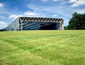
The design of a bank is what made Norman Foster. After returning to Britain from Yale, he was inspired by American modernism and SOM in particular and re-imported modernism back into Europe via a style that was compatible with business, High-Tech. Foster made High Tech an art form, and designed a series of beautiful sheds, everything from houses to offices to art galleries with the physical form of a hangar but the sophistication of a jet fighter.

sainsbury
[ Foster’s Sainsbury Center, 1977. A beautiful shed, the physical form of a hangar with the sophistication of a jet fighter ]

His big break came when a bank, HSBC, commissioned him to design their Headquarters in Hong Kong, with the simple but historic brief to build the world’s best building. I joined the practice shortly after the Hong Kong Shanhai Bank HQ was finished and it was clear that the company was experiencing the kind of rapid growth that is more characteristic of the technology startups that I later worked for in the Bay Area. But the culture of Foster and Partners (as it was then called) was different from firms in Silicon Valley with one notable exception – Apple, the place that combined geek business inventiveness without its reputation for poor aesthetic sensibility. Perfecting the model of selling design that is compatible with big business, Foster simultaneously grew one of the largest architecture practices in the world while still winning awards for design excellence. The secret was to design buildings like the limited edition, invite only Porsches that Foster drove and fellow Porsche drivers would commission them.

porsche-356-silver
[ Foster made buildings and Apple made computers like Porsche made cars ]

Jobs went further, however, he managed to create products that were designed like Porsches and made them available to everyone, via High Tech that transcended stylistic elements. An Apple product really was high technology and its form followed function, it went beyond the Porsche analogy by being truly fit for purpose in a way that a Porsche couldn’t, being a car designed for a speed that you weren’t allowed to drive. Silicon Valley capitalism had arguably delivered what the Soviets had dreamed of and failed, modernism for the masses. An iPhone really is the best phone you can buy at any price. To paraphrase Andy Warhol: Lady Gaga uses an iPhone, and just think, you can have an iPhone too. An iPhone is an iPhone and no amount of money can get you a better phone. This was what American modernism was about.

iphone1g
[ An iPhone is an iPhone and no amount of money can get you a better phone ]

The idea of American modernism for the masses arose from an ideology that was the opposite of the European one, the ideology of extreme individualism that epitomizes Silicon Valley, libertarianism, a watered down version of the kind of stuff that Nietzsche wrote about. Steve Jobs may or may not be a libertarian but his story and Foster’s and of uncompromising design are an intrinsic part of the culture that has emerged at the heart of the Mecca of technology and which defines it.

The image of the architect in the vein of Nietzsche superman is epitomized in Ayn Rand’s Nietzsche-light novel, the Fountainhead which depicts a modernist architect who struggles for success by being utterly uncompromising. There is even a Fountainhead-like novel directly inspired by Foster. Philip Kerr adapted Foster as the thinly disguised lead character of his high-tech thriller Gridiron which depicts the designer as a selfish monster who is crushed to death by his own building.

gridiron
[ Gridiron – The Fountainhead with a Norman Foster based protagonist ]

If you speak to people who work for Jobs or Norman Foster the rumors that circulate would seem to hold up this idea of an Ayn Rand style control freak. That Steve simply cannot ever, ever let it drop as regards Gizmodo publishing the leaked iPhone 4, an ultimately trivial event that had as large an impact on the Twitto-blogosphere as a revolution or Coup D’Etat or that Norman fired someone on the spot after specifying the wrong door handle (not by Elementer), something that is literally akin to a Fountainhead. But these rumors are just that, they are to some extent what people want to believe as much as what they pretend not to want to glorify, that the boss wears black leather gloves and sits in a room full of shark tanks stroking a white cat, like a diabolical Bond villain.

The truth is more complicated, Foster and Jobs perhaps distance themselves from personal relationships with their employees in the way that does enable a certain amount of ruthlessness but perhaps this is proof that the human side exists. Foster grew up poor, loved his wife who died of cancer more dearly than anything in the world and adopted a friend of his son’s to give him a better life. Jobs was himself adopted, has suffered and battled heroically against his own cancer and has championed what matters in life beyond material wealth as eloquently as anyone, most notably in his Stanford Commencement speech.


[ Steve Job’s iconic 2005 Stanford Commencement Speech – have a dream ]

Apple appears to operate in a similar model to an architectural practice and Jobs’ involvement seems similar to the mode in which Foster operates. In a big organization the leader cannot do everything, so needs to delegate and this is achieved through a hierarchy and chain of command. But in a model which is based on creativity and attention to detail, how do you see the details if you are miles away from them at the top of a hierarchy. How do you keep control over the design of the fountainhead or the door handles or the color of the headphones?

The answer is what might be called the sand pile model and it operated at Apple and Fosters, the boss sits independently from the structural hierarchy, to some extent, and can descend at random on a specific element at will. The boss maintains control of the overall house style by cleaning up the edges at the same time as having a vision for the whole, like trying to maintain a sand pile by scooping up the bits that fall off as it erodes in the wind. This is the hidden secret of design firms or prolific artists, the ones where journalists or historians agonize whether a change in design means some new direction when it just means that there was a slip up in maintaining the sand pile. For example, there was an architecture competition entry from Foster that the Guardian Architecture critic thought represented a new style, when the reality was that Foster was on vacation when the office produced it, the first time he saw the design was on the private jet he took to present it.

So does that mean that Foster is a fraud – absolutely the reverse. This is the exception, as they say, that proves the rule. The absolutely stupendous thing is that Foster managed to maintain a level of artistic integrity by being involved in so much of the artistic output of the office by popping up randomly and quizzing unsuspecting employees about what they were doing. This is where the ‘getting fired over the wrong door handle’ myth comes from, and it parallels the accounts of Jobs at Apple where Steve Jobs’ hand written notes passed to a blog editor about his website design on the iPad create the myth of god like omnipresence because they assume that Jobs is present for all involvement like this all the way up the hierarchy. This myth creates the impression that Jobs is author of absolutely everything Apple.

Its a flaw of human nature to assume that revered individuals are authors of everything they touch. When historians argue over whether a Rembrandt is authentic, they miss the point, no Rembrandt was truly authentic, they were painted by a team that included Rembrandt himself to a greater or lesser degree, to maintain the house style. And there is one great anecdote that nails this myth of authorship – the famous Walt Disney signature. Walt Disney had really bad handwriting and someone else in the office created the recognizable version. When stills from Snow White were auctioned those that bore his actual signature fetched less than those with the iconic one. True authorship is a myth and this applies to Jobs.

mickey-mouse
[ Disney had Mickey Mouse hand writing, his signature wasn’t his ]

The influence of Foster on Apple’s design goes beyond the abstract, the core elements of the Apple stores themselves lead indirectly to several famous architects but Foster in particular. The 5th Avenue store owes more to IM Pei’s Louvre pyramid for example, but its a later version of the prototypical version which is best represented by the first Manhattan one in Soho. The Soho store is a box with a central rooflit void containing a translucent glass stair. This is an identical description of Foster’s Mediateque in Nimes in France where such glass stairs were perfected.

Nîmes (30)
[ Foster’s Mediateque in Nimes, 1993, which perfected the glass staircase that became the iconic component of Apple stores ]

Foster is at his best creating buildings that exist as perfect diagrams, the Sainsbury center is a bubble chamber, a U-shaped tunnel with an oblique entry and a spiral, the Reichstag is an inversion of oppressive classicism, an open fishbowl for a new democracy and Stanstead is an attempt to put all the crap in an airport out of sight to create an airport that contains mostly air. The less good buildings, such as the Gherkin which are part of the Dubai influenced trend of funny shaped towers with rather ordinary floor plans weren’t really designed by him (Ken Shuttleworth was primarily responsible for the Gherkin), and as he moved to Nyon a few minutes away from where I live, near Geneva, perhaps Foster is no longer as involved in the London based firm’s designs. But I hope that with the Apple campus he is, it’s a perfect diagram, a squashed glass Apple the size of a town and with a layout like Burning Man. Unlike the Gherkin and despite what people say for the benefit of planners (it’s a giant spaceship) the shape isn’t that unusual or important, but its simple enough to allow for the attention to detail, in beautiful, giant curved glass swathes, that epitomizes Apple.

apple-hq-003
[ A squashed glass Apple the size of a town and with a layout like Burning Man ]

It would be a fitting cap to an illustrious career and the achievement of a long term goal that Fosters never quite pulled off (even if you include the Hearst Tower in NY) to re-import his quintessentially American style from Europe, repeating what Jonathan Ive did for product design under Jobs, and to produce something that becomes an American cultural landmark, something which Silicon Valley lacks.

Human Incentives Graphs

Posted by | half baked ideas | No Comments

Graph is a term used in mathematics for a spider web style series of points and links. And because of the web and in particular, social networking (think ‘social graph’), its understanding has come into the mainstream.

A weighted graph, treats the links like little springs, where the weighting creates forces in the links which then determine the shape of the spiders web.

Reading this article on the emergence of what may be imaginary epidemics in the US, such as autism and bipolar disorder, it struck me that they could perhaps be predicted and identified using a weighted graph of incentives. The older I get the more it seems to me that people very rarely take a view that isn’t in their own interest (people in cities take liberal views rather than liberals living in cities). Conspiracies rarely seem to be real because people are not that organized and that this rather than active collaboration creates the illusion of conspiracy.

In other words:

(a) Its in a drug company’s interest to believe in bipolar disorder to sell drugs.
(b) There is no incentive for a Doctor to challenge a diagnosis of bipolar disorder, she could get sued for not but won’t for doing so.
(b) Parents and human beings in general want simple concrete answers that they can act on – so there is a tendency to label people as having diseases when they are nebulous. (i.e. you won’t get wrong diagnoses for missing a leg but you do for autism etc.).
(d) The scientific community will bolster the idea of the existence of the disease, under social pressures (this one is perhaps the hardest to buy, but here is a real example, where a paper on ADHD rates in the US, which are 20x that of say the UK, looks at whether it is disease caused by Us lifestyles or is under-diagnosed abroad. It ignores completely, the third possibility, that it is over diagnosed in the US. It’s possible that this is because it is not in the authors’ interests to espouse the heresy that children are not suffering from a disease, because anything to do with sick children is an emotionally charged subject. In other words, the consensus has swung away from the truth, due to self interest weightings and its a subject where challenging the consensus will make you look wicked).

An incentive graph would show that autism diagnoses are in everyone’s interest and so will self emerge, passively, without any active conspiracy and independent of whether they are true or not. It would consist of various actors (e.g. doctors, drug companies in the example above), and various opposing stances (autism, not autism).

e.g.
Autism—(diagnosis)—Doctor———-(diagnosis)———-Not Autism
Autism—–(epidemic)—–Drug company——–(epidemic)——–Not Autism
etc.

Each of these 2 dimensional mini ‘tugs of war’, where the dashes are less on the left indicating a percentage bias towards the stance on the left, would create a three dimensional graph when multiple stances were introduced for each actor.

Anyone want to help me build an incentive graph application?

Pinepoint – a town that isn’t there anymore …and Powerpoint.

Posted by | Uncategorized | No Comments

The subject matter of this interactive presentation is fascinating in itself a haunting story of a town that lived a single generation and died, like a person.

But beyond that its an example of how the Powerpoint style presentation format: annotated slides, with embedded media, is evolving from being the most artless thing on the planet to something sublime, when its in the right hands.

Pinepoint

How to Solve Berlin’s Gentrification War.

Posted by | Uncategorized | 3 Comments

Berlin’s slow-burn emergence as Europe’s cultural capital has resulted in a deep rooted creative scene, but that is being threatened. Berlin’s artists are now rebelling against a Yuppy invasion.
One of the problems with gentrification is that the people that originally make an area more desirable (artists) don’t gain and the people that gain (yuppies), often make it less desirable. The reason for this is that creatives rent and can’t buy, and yuppies buy but don’t create.
But imagine a property fund that was based on a simple rule – follow the artists, it would make a fortune. It should be possible then to fund the arts through some mechanism that capitalizes on this.
An arts fund that created artists mortgages with the expectation that they increase the value of properties without normally benefiting (as happened in Shoreditch) could really help mitigate this kind of change, without any external subsidy. It could be run as a non-profit – but would make a healthy one which is fed back into urban regeneration.
The artists wouldn’t be squeezed out at the inflection point of gentrification (the subsidized mortgages would be funded by the those who decided to sell out, since the capital value increase would be higher than for ordinary mortgages, and a percentage of the profit would be taken by the arts fund). This would dampen the negative effects of change and mean that instead of artist flight and a process of gentrification which destroys the very character that started it (as has happened in NY’s SOHO) you would get organic and long-term, sustainable improvement to neighborhoods.

The Emperor’s New Clothes

Posted by | Uncategorized | One Comment

Claiming that a work of art is nothing more than an example of ‘The Emperor’s New Clothes’ is often met with derisory ‘you just don’t get it’ eye rolling or the ‘can’t you think of anything more original to say’ look.
Yet its often the best way to describe what is rarely acknowledged: that art, particularly in a secular age, is necessarily deceitful, in a way that religion and alchemy are.
Art is a religion where you only have to believe temporarily, for 90 minutes in a movie theater, it mostly has no meaning at all, and fails most when it tries to (like anything in a white walled gallery post Duchamp). But like a magnificent cathedral its is often no less fantastic.
I’m going to build a collection of links and examples here, for a larger post on the subject.

The Genealogy of Tools

Posted by | half baked ideas | 2 Comments

For organisms, their shape is the phenotype, which is created by the genotype – the DNA. A true family tree is ultimately based on DNA. There is no exact equivalent for man made things, however some objects are more like the phenotype and others more like the real DNA, tools vs the things that make them.
The Midnight Moses explains what I am getting at better: “Every single manufactured object was created using a tool or set of tools, and every single tool itself was manufactured using a tool or set of tools, and so on. Every single manufactured object, therefore, possesses a vast and complicated ‘family tree’ that pares and branches back through time”.
Wouldn’t it be fun to be able to trace the family history of Large Hadron Collider back to a flint axe. Ironically, since the LHC is a demolition tool for making sub atomic particles, you could potentially go full circle.
How could this be done.
First you need to separate what a tool is from any other type of object. A tool is something that can make another object. Some tools make objects that in turn cannot make another object (this is like having infertile offspring). Some tools make objects that have already existed before, and some tools can make new objects that have never existed before. A chain of tools that can make new tools that can make new tools that couldn’t have been made before, is the most interesting one from a genealogical perspective.
The process is similar to genealogy but with three differences: (1). a tool can have components with different sets of parents for each (parents being the tools that are needed to make it), for human beings, the same parents make the arms as the legs, body, liver, head etc. (2). each component can have more than two parents (there might be three of more tools that needed to exist before something could be made). (3) Tools potentially keep having offspring forever (they don’t die), a simple axe might be needed to develop something new, today.

How architecture keeps you comfortable and can be understood from the design of decent modern shoes.

Posted by | Uncategorized | 2 Comments

Doing some architecture again (renovating this) after fifteen years is making me look at it with a fresh eye.

For example, there is a big problem with green building terminology, it often says the opposite of what it means and many architects seem to have misunderstood the design issues because the terminology is misleading. As an example of the lunacy in terminology, in the context of building materials (and clothing), breathable usually means airtight. This often makes things hard to understand, but the design concepts are actually straightforward and I’ll try and decipher some of them here.

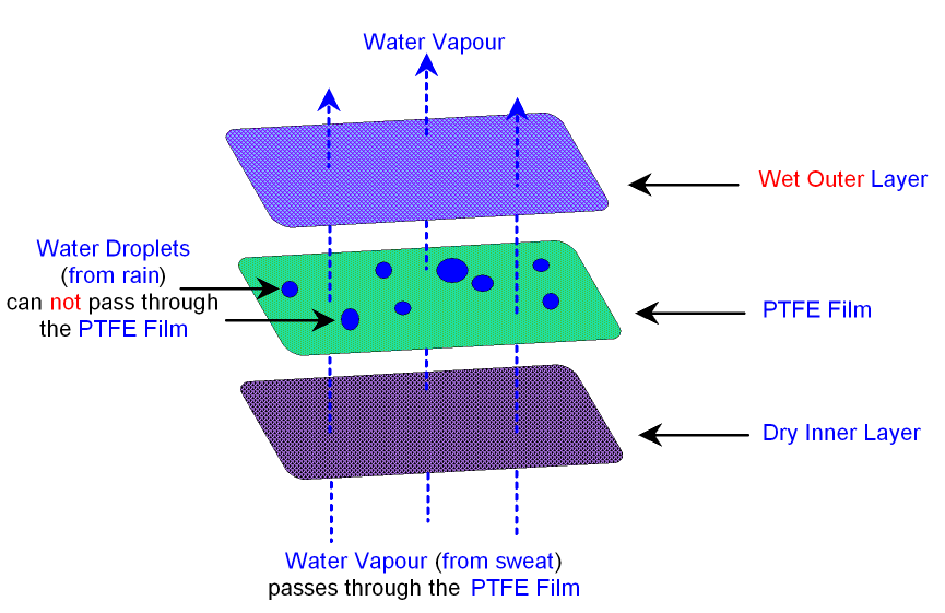
Most of the innovation of the last 15 years is mirrored in the modern technology used in sports clothing and most of what there is to be understood about architectural innovation, such as breathing and composite materials can be understood from the design of decent modern shoes.

Once you’ve got a building to stand up, you want to: (a) avoid water getting in by flowing, but (b) let water vapor (sweat and steam) get out by soaking and then evaporating and (c) not let too much heat to get in or out via conductance or draft.

Because building usage and climate are dynamic but building envelopes are not, there are no ideal solutions. The best you can hope for is to dampen the extreme cases and create what Reyner Banham called a ‘well tempered environment’, after all, perceiving the different seasons is pleasant, unless you live at the North Pole.

For the water vapor, air and water, buildings often have vapor barriers and air barriers. They can be the same thing. Vapor barriers are often required by code but scientifically optional and air barriers are often optional but scientifically necessary.

A vapor barrier stops diffusion of water gas through a difference in humidity. An air barrier stops flow of air through an air pressure difference caused by temperature difference (resulting in wind or convection).

Now for the hopeless terminology that leads to all the confusion.

Water vapor is a gas, but a vapor barrier is essentially to do with dealing with water (which we tend to think of as a liquid) and the effects of soaking rather than leaking. Vapor barriers are not about leaks but about surface transfer through diffusion or soaking, so vapor barriers can be made from the opposite types of material: a waterproof material such as a plastic bag (water condenses on its surface and evaporates) or, in theory (but in practice only in the case of clothing such as linen), a water absorbent material that soaks the water vapor up for a bit then lets it evaporate later. In the building case this is when people leave out a vapor barrier and use insulation which can soak up a bit of water temporarily, without damage. This ironic situation is a bit like the difference in a bulletproof jacket that works by opposite means, either bouncing bullets off (hard material like steel plate) or absorbing the impact (soft material like a sandbag).

The air barrier is not so much about heat loss as about water vapor getting trapped and condensing – i.e. the primary purpose of an air barrier is to be a water barrier. But the water gets there this time via drafts and not diffusion.

Secondly, an air barrier can be breathable. Breathable means letting water vapor out, by diffusion, while still being windproof. As above, this means you can use the opposite approach – thick water absorbent and wind proof or thin wind proof with little holes for diffusion (think Goretex).

And the confusion doesn’t just extend to the terminology, it extends to the practice:
Vapor barriers are often required by code but science suggests they should be optional. Their position is not optional yet it is – i.e. it should always go on the humid side of insulation, but this can be on the inside or the outside depending on the climate and the occupancy of a building, both of which change. Buildings in Florida are often the reverse, in terms of moisture control, from New York. Vapor barriers, although they are dealing with a gas, do not have to be air tight, they just need to cover enough surface area.

Air barriers on the other hand are optional in codes (shortly to be mandatory) but a proven idea scientifically. You can put an air barrier anywhere in the envelope, but it should form a continuous sheet – i.e. be airtight. An air barrier can be a vapor barrier as well (in which case you should put it in the right place, warm side, or more accurately ‘more humid side’ of the building envelope).

If an air barrier is non-breathable, don’t stick it to the cold side (outside) of insulation without a gap, or water will condense and not be able to evaporate. In general, where water condenses there should be some air flow on the side of the material it condenses on.

Air barriers mean air tight, and they are the principal behind the idea of things such as Passive Homes which seal things up like a thermos flask then have to add drafts back to get rid of sweat and steam via fans.

Ironically, because the science behind Passive Houses is psychologically clinical and unnatural it seems opposite to the idea of traditional building styles which controlled the environment automatically by imperfect fit and natural materials. Yet the people who champion the latter are the natural allies of what Passive Homes are trying to do – be ecologically sound. There is a commonly held miss-belief that Passive Houses, because they are air tight aren’t breathable. Traditional materials are breathable, but so are air tight buildings, since the breathability refers to moisture release through diffusion rather than movement of air.

To remove the confusion:

1. Think of a vapor barrier as a ‘water condenser and evaporator’ system (it need not be a barrier at all and its a mechanism rather than a thing). You need a system, but you don’t necessarily need the thing.

2. An air barrier is a genuine barrier, it’s a ‘draft excluder’, but the fundamental problem is not the air but the water it carries getting left behind. An air tight system can still be breathable and be a combination air and vapor barrier, but the word breathable would be much better if it were replaced with something like ’self drying’.

In other words a building design should stop water getting trapped in bits of the building envelope and get rid of any that does through evaporation, using air and vapor barriers.

You need a self-drying draft excluder. That’s all there is to it.

Tim Berners-Lee: Confirming The Exact Location of the Invention of the Web

Posted by | Uncategorized | 81 Comments

theroom

[ Update, Feb 2014. Plaque placed outside room where web was invented.]

Success (of sorts)!

ARS Electronica have given an award to Tim Berners-Lee and CERN for the invention of the web. They had heard via a friend at CERN that I had shown the room where the web was developed and explained the story, that the existing commemorative plaque was outside where the web was developed, not where it was invented and where the first web server was located.

They insisted that their plaque go outside the latter location, which means that there is now a plaque outside the room where the web was invented, making it much more likely that it will survive any accidental renovation.


[ Update, April 2013. Save the Room ]

CERN have just announced that they are re-hosting the first web page. It would be great to take this further and host the original web server in the room where it was first located.

I have been trying to pitch this to people at CERN but haven’t managed to persuade anyone yet, and since the room is used as general office space at CERN its is in danger of being refurbished or changed.

Why would you want to do this?
To celebrate the invention of the Web is to celebrate knowledge, its not a piece of religious of political heritage but something that everyone can be a part of. Unlike many other inventions it has a known location and that location is currently unchanged, but there is nothing to protect it.

I suspect that in 100 years, CERN’s legacy as the birthplace of the web will surpass the discovery of the Higgs, W or Z bosons. The web will have had an impact on every day life which could be compared to that of printing, in which case this location could be compared to Guttenberg’s workshop, which had to be reconstructed many years after, when people realized its importance, too late.

Now you could argue that the web is not as important as the invention of printing (I disagree) but its certainly up there with say a major artist’s studio. In which case, consider the extraordinary length’s taken to preserve the floor in Jackson Pollock’s studio and consider that the room where the web was invented is treated just like any other room.

What could be done?
Space is scarce at CERN, and expense has to be justified, so one way of preserving this room would be to make the occupant have some knowledge of its significance and some relevance to it. When I first visited the room the person using it was a computer guy who did not know what had happened there and was very excited to find out. So that would be enough – that the occupant was a computer scientist and that the room was not to be altered.

Taking this a bit further, perhaps a computer scholarship could be created to fund the occupant of the room to do something that takes the spirit of the web further. Perhaps the original web server could be relocated to the room and it could be explored by mapping it on say Google Streetview, so that everyone could visit it. Further still, there are the rooms where the project for the web was developed, these are also historically important.

If you believe, like I do, that preserving the location of the invention of the web would be a good idea, make yourself heard. Tweet to @CERN with this url and the hashtag #savetheroom.

Save The Room!


[ Update, Jan 2012: One of the more interesting consequences of the details below, that hasn’t been picked up anywhere, is that technically the web was invented in France, not Switzerland.]

bldg31

The blue marker on the map above shows building 31. Note where the border is.

I’ll bet if you asked every French politician where the web was invented not a single one would know this. The Franco-Swiss border runs through the CERN campus and building 31 is literally just a few feet into France. However, there is no explicit border within CERN and the main entrance is in Switzerland, so the situation of which country it was invented in is actually quite a tricky one. The current commemorative plaque, which is outside a row of offices where people other than Tim Berners-Lee worked on the web, is in Switzerland. To add to the confusion, in case Tim thought of the web at home, his home was in France but he temporarily moved to rented accommodation in Switzerland, just around the time the web was developed. So although, strictly speaking, France is the birthplace of the web it would be fair to say that it happened in building 31 at CERN but not in any particular country! How delightfully appropriate for an invention which breaks down physical borders. ]


I wrote to Tim Berners-Lee after exploring CERN looking for the location where the web was invented. His replies regarding the exact locations are below (I’ve put up photos of the excursion as an Oobject list, here ).
There is a plaque in a corridor in building 2, but no specific offices are indicated and there is some ambiguity as to what happened where, in building 31. Thomas Madsen-Mygdal has a gallery showing locations in building 31 and 513, but there are very few places on the web documenting these places. I took photos of the plaque, such as the one here, with Creative Commons licenses, so that they could be used elsewhere.

The reason I’m interested in this is that recognizing the exact places involved in the birth of the web is a celebration of knowledge itself rather than belief, opinion or allegiance, both politically and spiritually neutral and something that everyone can potentially enjoy and feel a part of.

Secondly, many places of lesser importance are very carefully preserved. The place where the web was invented is arguably the most important place in 2 millennia of Swiss history and of global historical importance.

Lastly, this kind of information is perhaps overlooked as being so obvious as to be common knowledge, exactly the sort of thing that sometimes gets forgotten. I’m not suggesting that the locations have indeed been overlooked, but they are not preserved or all indicated and the people I spoke to didn’t know the full details. So just in case…

DG: Where were you (at CERN and which building/rooms or home) when you thought of or were writing the original proposal for the web in 1989?

TBL: I wrote the proposal, and developed the code in Building 31.
I was on the second (in the European sense) floor, if you come out of the elevator (a very slow freight elevator at the time anyway) and turn immediately right you would then walk into one of the two offices I inhabited. The two offices (which of course may have been rearranged since then) were different sizes: the one to the left (a gentle R turn out of the elevator) benefited from extra length as it was by neither staircase nor elevator.
The one to the right (or a sharp R turn out of the elevator) was shorter and the one I started in. I shared it for a long time with Claude Bizeau.
I think I wrote the memo there. [ dg: proposal for the web was written, i.e. web was ‘invented’ in room 2-010 ] When I actually started work coding up the WWW code in September 1990, I moved into the larger office. That is where I had the NeXT machine, as I remember it. [ dg: larger office, i.e. where first web server was and software was written, where web was ‘created’, is room 2-012 ] The second floor had pale grey linoleum, the first floor, where Peggie Rimmer had her office, had red lino; the third floor had pale yellow lino. The ground floor had I think green lino. Also on the second floor was the Documentation et Données, later Computing and Networking, HQ with David Williams at one point heading it up.

DG: For the development of the web, can you remember which offices were used in building 31 or off the corridor shown in building 2 in the attached image?

TBL: Building 2 I never had an office in. Robert Caulliau did, and various students, including Henrik Frysyk Nielsen and Hakon Lie, and Ari Luotonen, worked there.

DG: Was some of it inspired at home and was that here: Rue de la Mairie, Cessy (France)?

TBL: My house was [exact address removed since people live there] Rue de la Mairie, but I rented it out for some time around 1990 and actually lived in Les Champs Blancs, Chavannes de Bois [Switzerland]. But then we moved back to Cessy for a year before leaving.

[ Update: I went back and took some pictures (Creative Commons license so you can use them) of the room where TBL created the original proposal for the Web. And have some exciting news to share about it soon! ]

room1

Door to the room where the web was created

room2

The Polish coder who currently occupies the room didn’t know its significance. He was very happy to find out.

room3

Ben Segal who helped setup the original web server in the room where the web was created

Connections’ 911 Connection. A Perfect Coincidence to Show There are no Conspiracies

Posted by | myth busting | One Comment

People look for patterns and co-incidences, and in the modern environment there are more co-incidences than our brains are calibrated to think are normal – what Richard Dawkins calls the PETWAC (Population of Events That Would Happen to Appear Co-incidental).

What follows below doesn’t appear to figure on the web as a 911 conspiracy, but it could easily. It sends shivers up my spine, but the fact that it exists among the millions of hours of video available to watch is merely an example of the increased PETWAC compared to when we drifted across the African Savannah hundreds of thousands of years ago in small bands of people with limited experiences available. This is the factor which creates the illusion that drives conspiracies.

1. The First Episode of Connections opens with James Burke Outside of the World Trade Center in New York. (Opening -> 0:48)

2. A disaster is brewing. (5:18 -> 6:50)

3. (8:45 ->) A plane is heading towards the buildings at the opening. Its flight number…